| 032 | Nike Fuel / Brand Interface Fitness tracking device identity and interface; strategy, interaction design and development, as R/GA |
38 | 2011 01 |
Fitness tracking device identity and interface; strategy, interaction design and development, as R/GA.
Core Team:
—Andrew Chee
—Manuel Dilone
—Jonathan Han
—Virgilio Santos
—Brian Schmitt
—Marc Shillum
Agency:
R/GA New York
01 / Intro
The challenge was to complete the digital user experience of a prototype sensor-laden physical device, launching a new universal metric and interface that motivated people to get active, stay active, and actively improve, across a variety of activities and sports. We created an identity system and a wide gamut of interface concepts that expressed activity in a form as useful and motivational to a teenager as to a senior, a system to be reused and extended by the various categories in the Nike universe of products and experiences.
02 / Concept
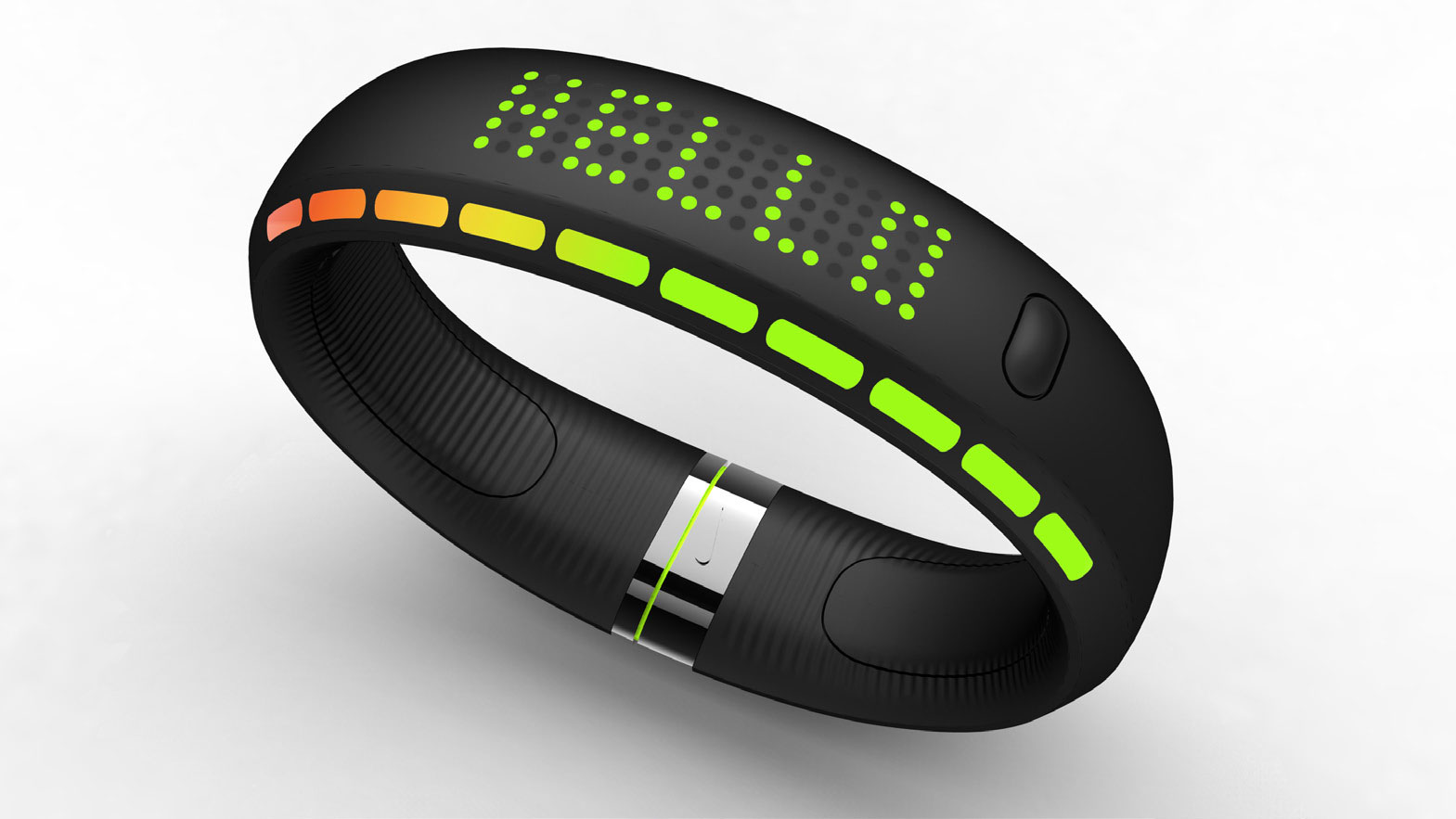
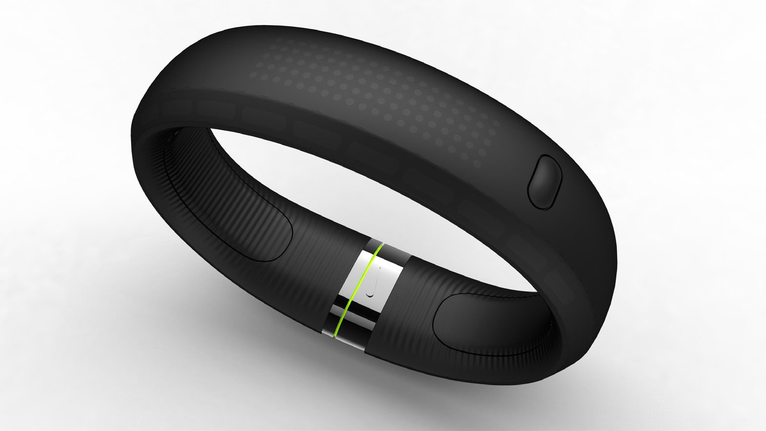
Nike aimed to create a new product platform that would answer the simple question, "How am I doing?" in real-time throughout the active lives of casual to intermediate users. The key hardware to kick off the platform in development by Nike was the FuelBand, a wearable that augmented what normally would be a digital watch with an accelerometer and simple data transfer (initially dreamt to be wireless, but quickly simplified by Nike to USB) to the user's various computing devices.
The assignment consisted of 3 parts:
- —Integrated user experience for all screens,
- —Development of a universal metric / currency
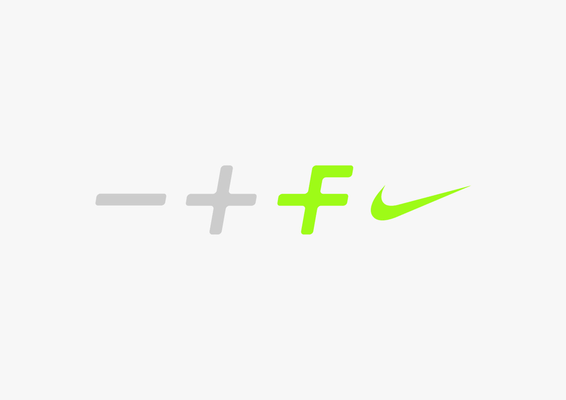
- —Identity and user interface system
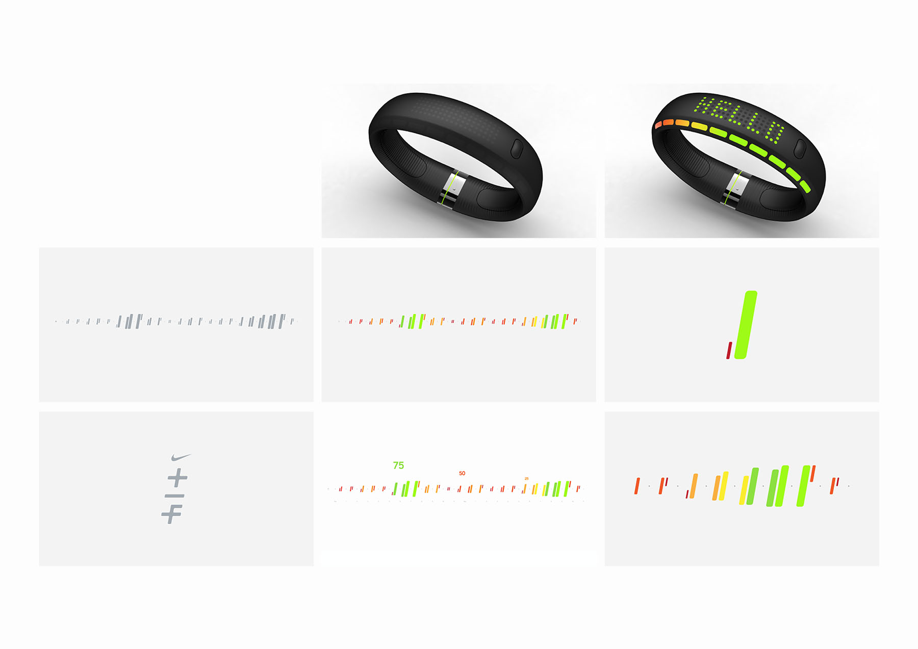
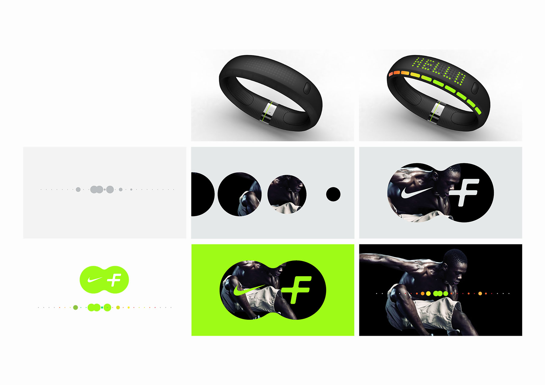
The first image represents the initial prototype for the device (designed by Nike), followed by the initial vision of positioning Fuel as the universal currency to tie together all "digital sport" and activities within the Nike world, a natural extension to the concepts and foundations laid by Nike+ (e.g., Running+, Basketball+, Futbol+, etc).
03 / Behaviors
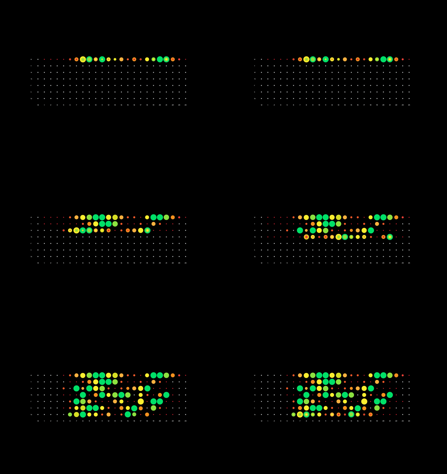
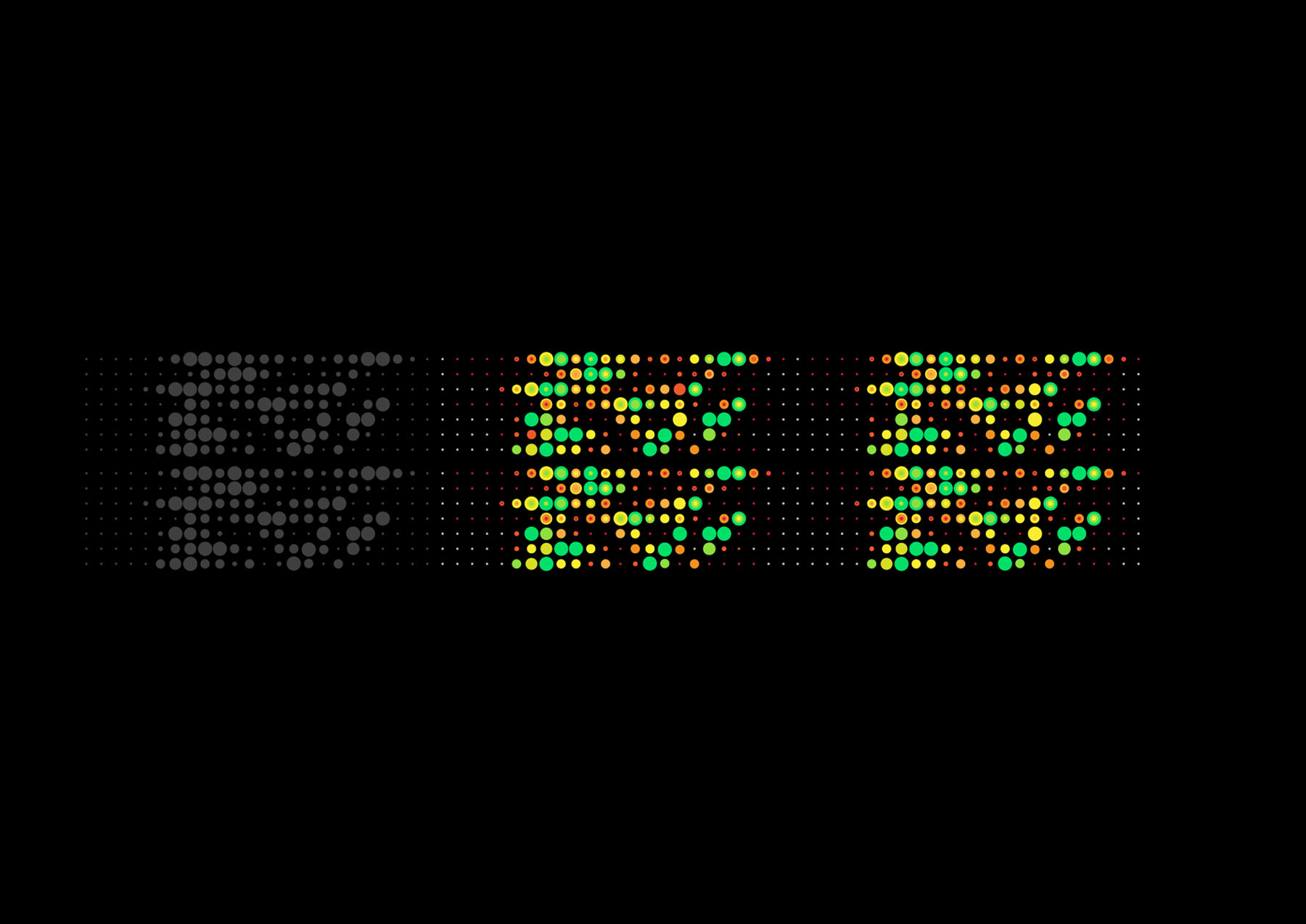
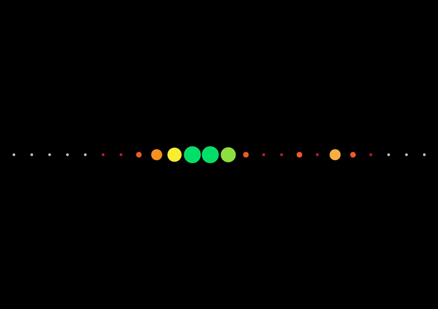
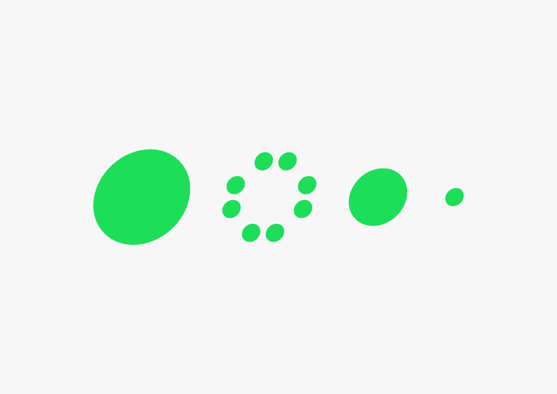
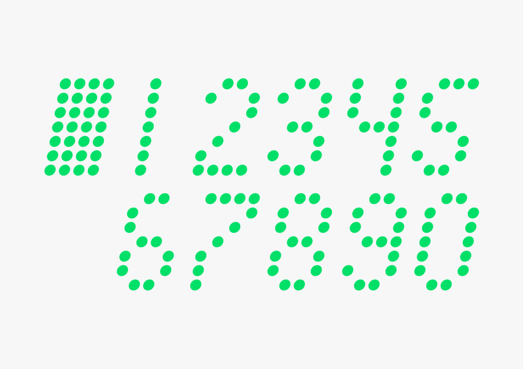
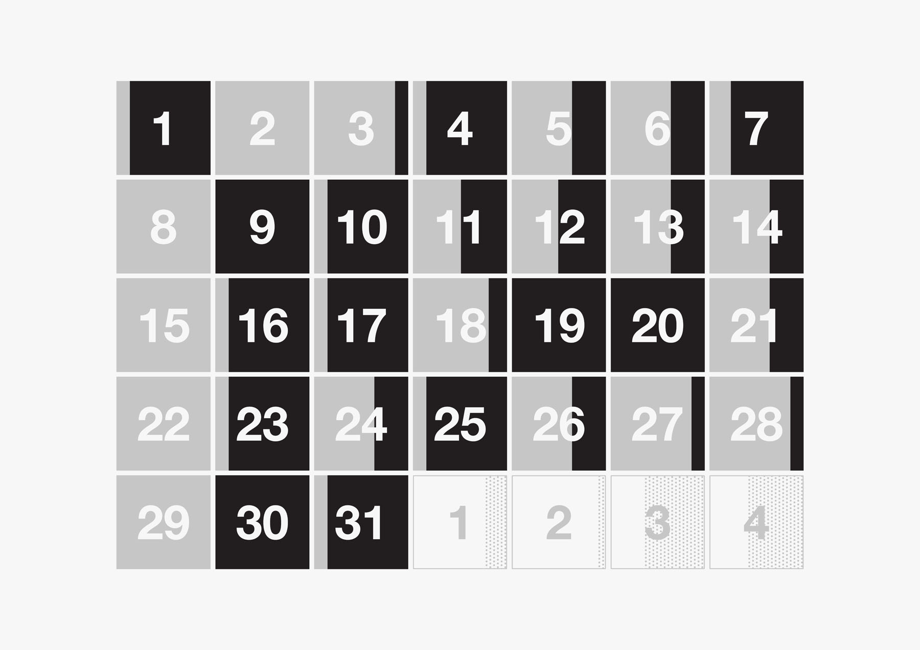
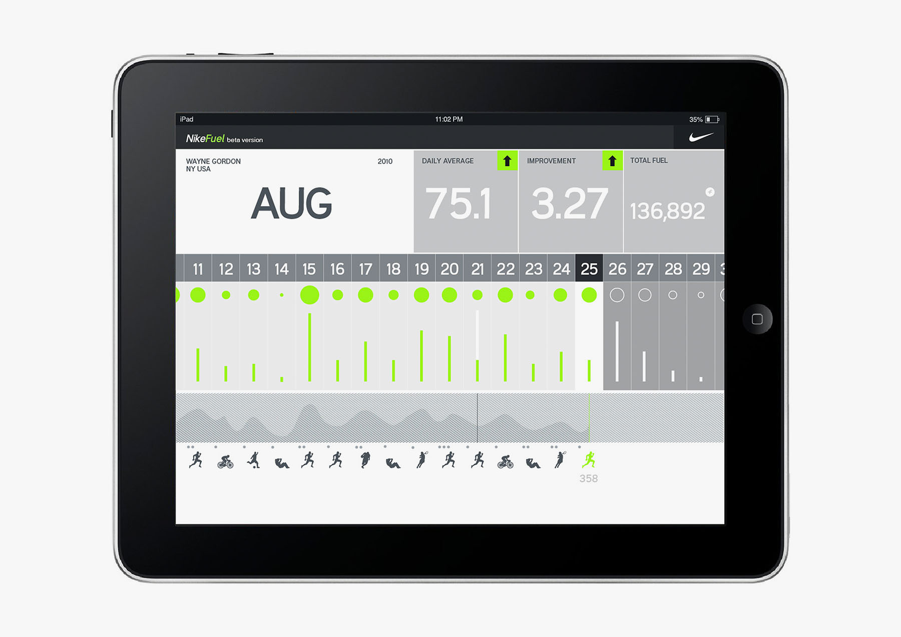
The hardware prototype quickly evolved. Taking inspiration from the color palette and dot matrix of the FuelBand, a graphic system was developed and explored, one that could easily convey progress over time in a playful, yet highly functional and analytical manner.
Explored, were representations of various activity from walking to high impact sport, various measures of time slices, goal-setting, friendly competition (individual or group).
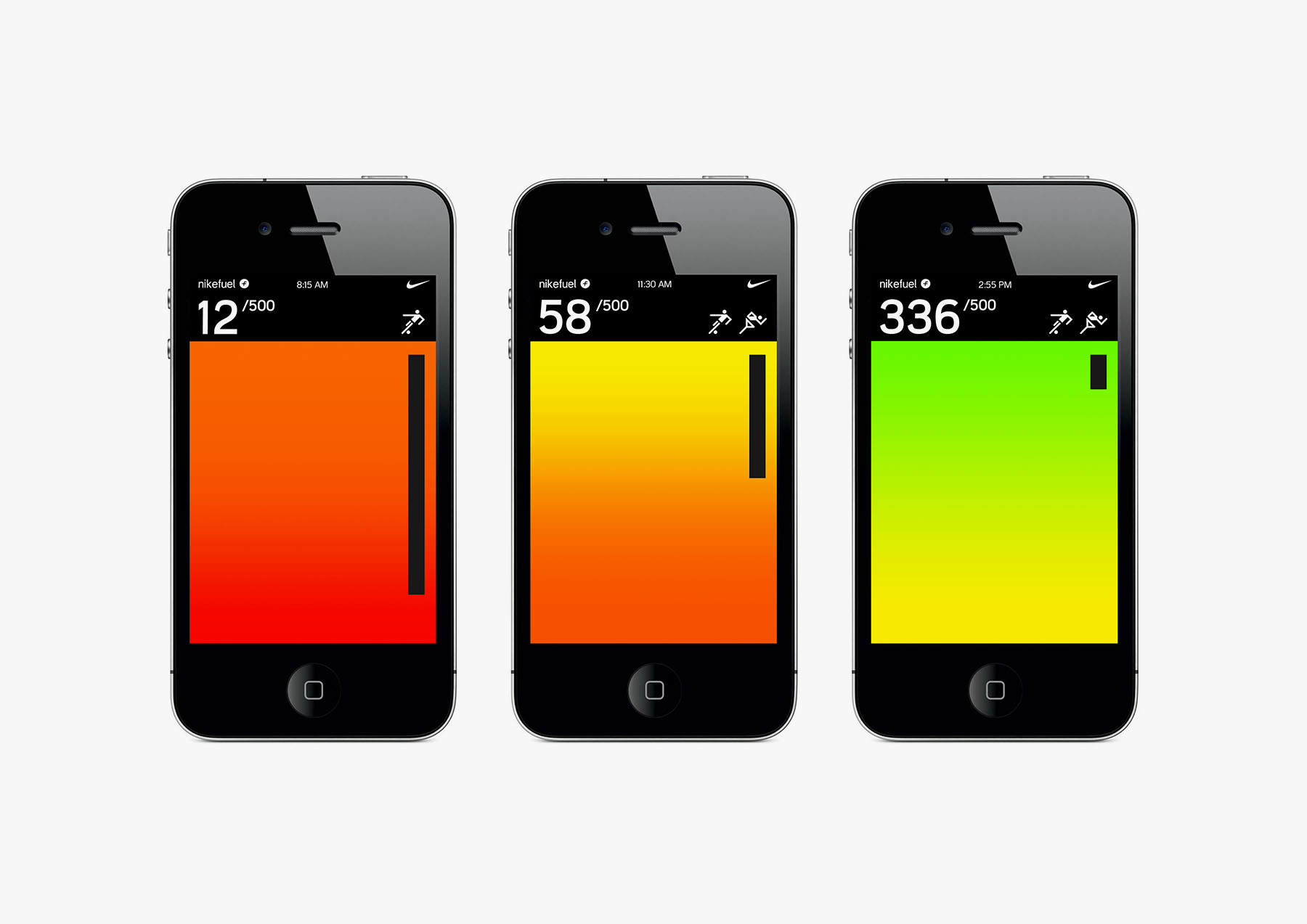
What developed were basic behaviors of the interface that were consistent with the characteristics of the hardware itself: color clearly as a temperature / bar of activity, forward motion as implied by what would most likely be scrolling animations for the LED matrix display, and related.
04 / Language
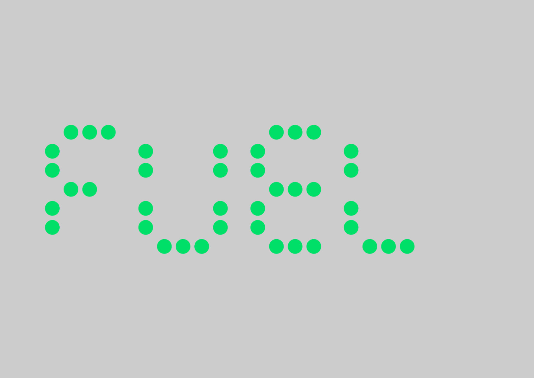
The dot matrix language was further developed and refined to create a consistent functional iconography and even a distinct dot typeface for the brand.
A brand manifesto developed in parallel, titled "Everything Counts."
Nike Fuel
is a driving force,
an impulse
an incentive,
a stimulus
an encouragement
resulting in increased activity.
NikeFuel is your reward
for being active.
Running counts.
Jumping counts.
Biking and swimming
and playing all count.
Every time you’re active, it counts.
Everything you do changes you.
Makes you stronger, faster,
or just a little more fit.
Everything counts and we can count it.
And since we measure it and track it,
we make even the most
trivial activity matter.
A reward given to you for
reporting your activity.
05 / System
Likely the most challenging part of the project was the definition of Fuel —the universal metric of activity. Many metaphors were explored, giving meaning to the dots "filling" and "depleting" as that of a battery, a fuel cell, a gas tank.
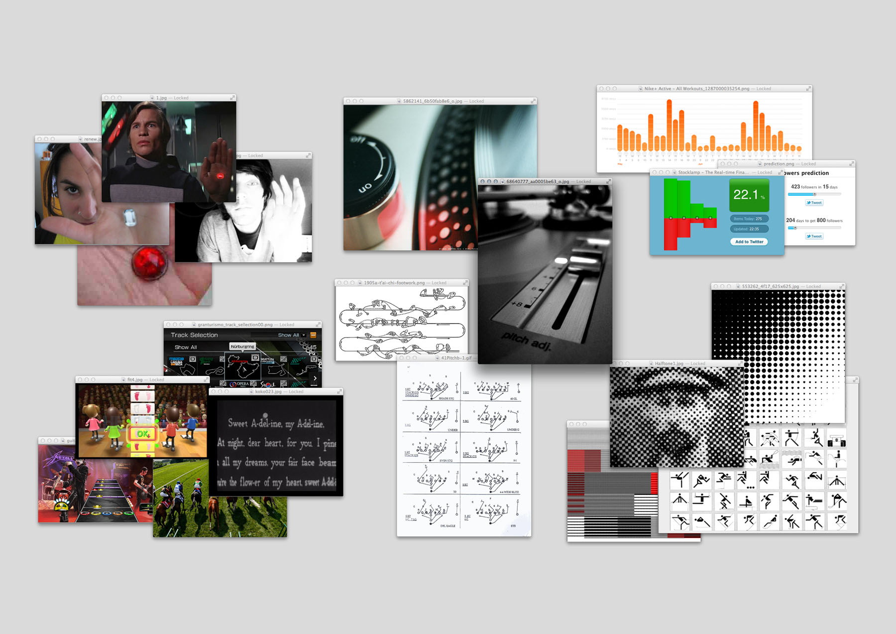
Inspiration/references abound. On the more emotional (perhaps darker) side, the life battery/indicator from Logan's Run —however this time, you could "renew" throughout the day and we'd dial down the anxiety just a tad. There was even a potential to display the earning of bonus life/energy. On the more analytical side, I looked at candlestick charting, a system apparently developed by the Japanese to trade rice in the 17th century, now ubiquitous in stock market technical analysis. Visualizing activity rhythms / momentum / pace were particularly interesting to me, likely because of an obvious linkage to analog turntable strobe rpm indicators, BPM (beats per minute), and related.
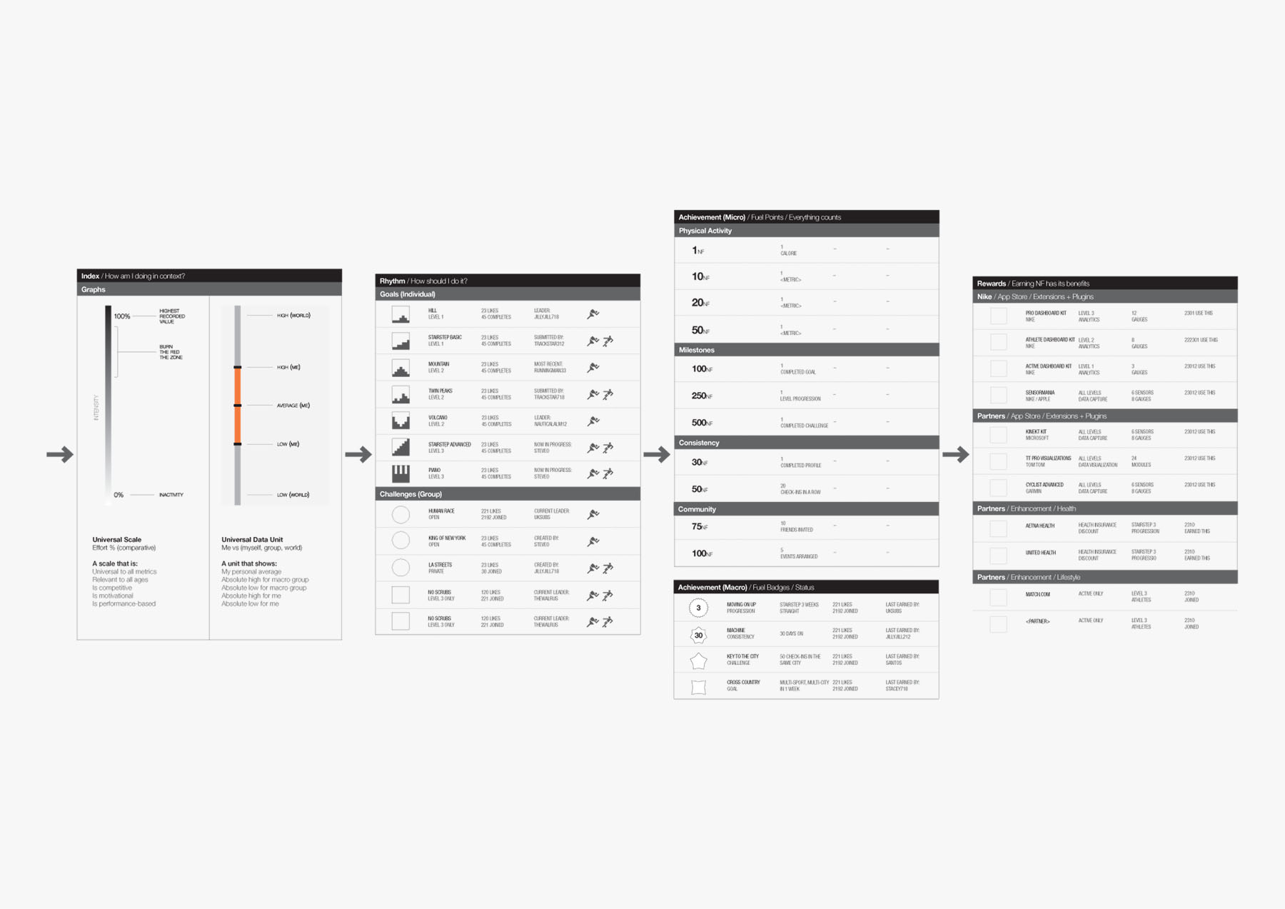
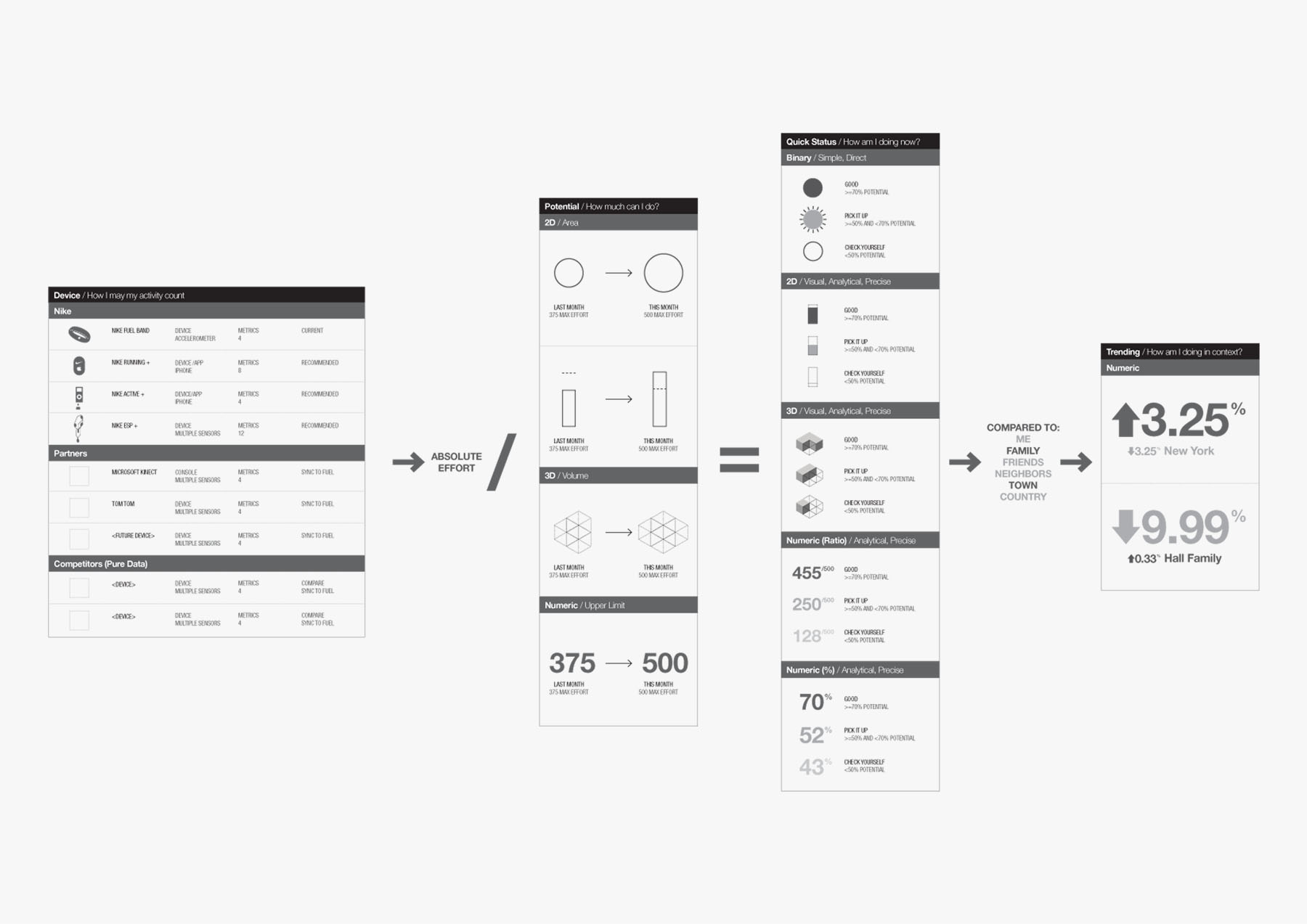
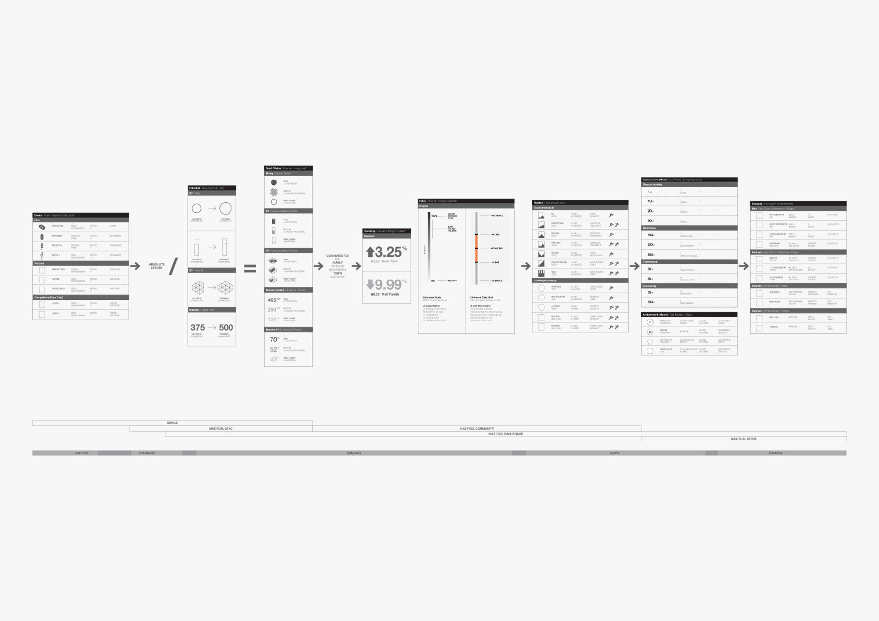
In the functional / flow diagrams, I illustrate a slice of the high-level user experience, focusing on the point of interaction with the device (FuelBand or partner integrations), to methods of:
- —Setting potential/goals
- —Showing progress towards these goals
- —Trending
- —Context with community
- —Different types of activity rhythms
- —Levels of achievement
- —Milestones/awards
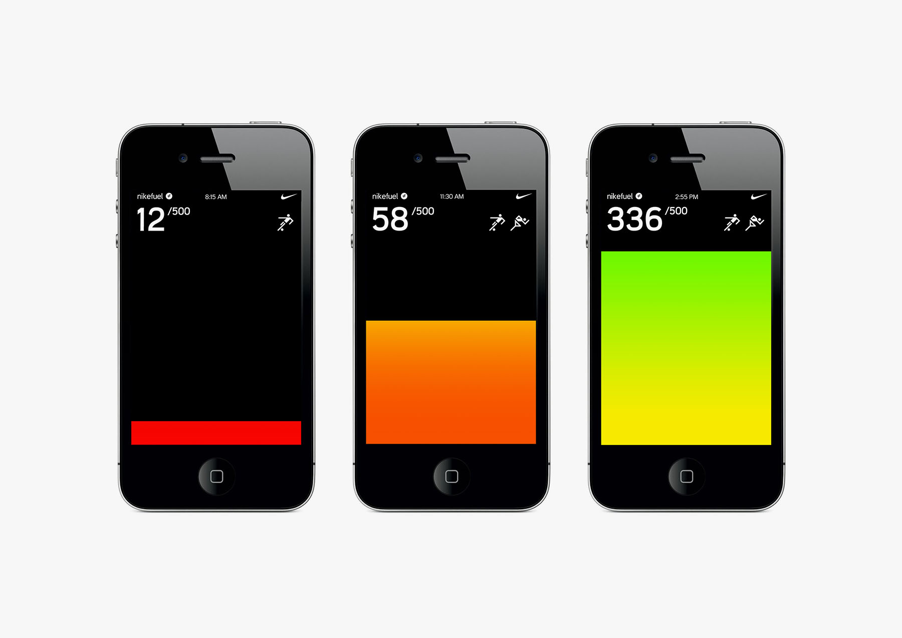
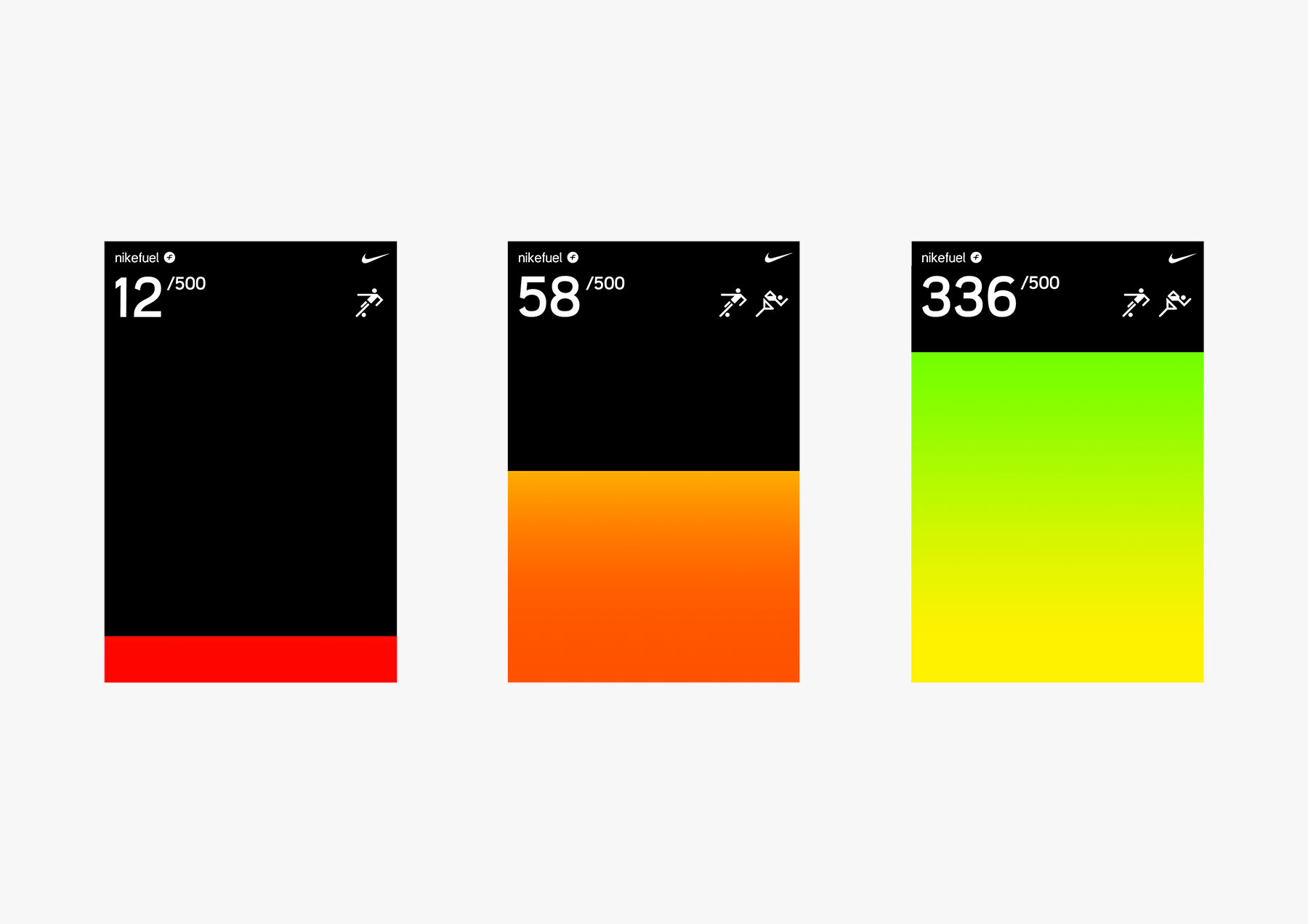
A key development in this stage was the importance of showing a surpassed as well as unachieved goal, and keeping this playful. Placed in a daily schedule, this "filling" behavior / system could extend graphically to any screen at any resolution.
06 / Expression
Iterations of the visual system, user interface, and interaction mechanisms.
07 / Refinement
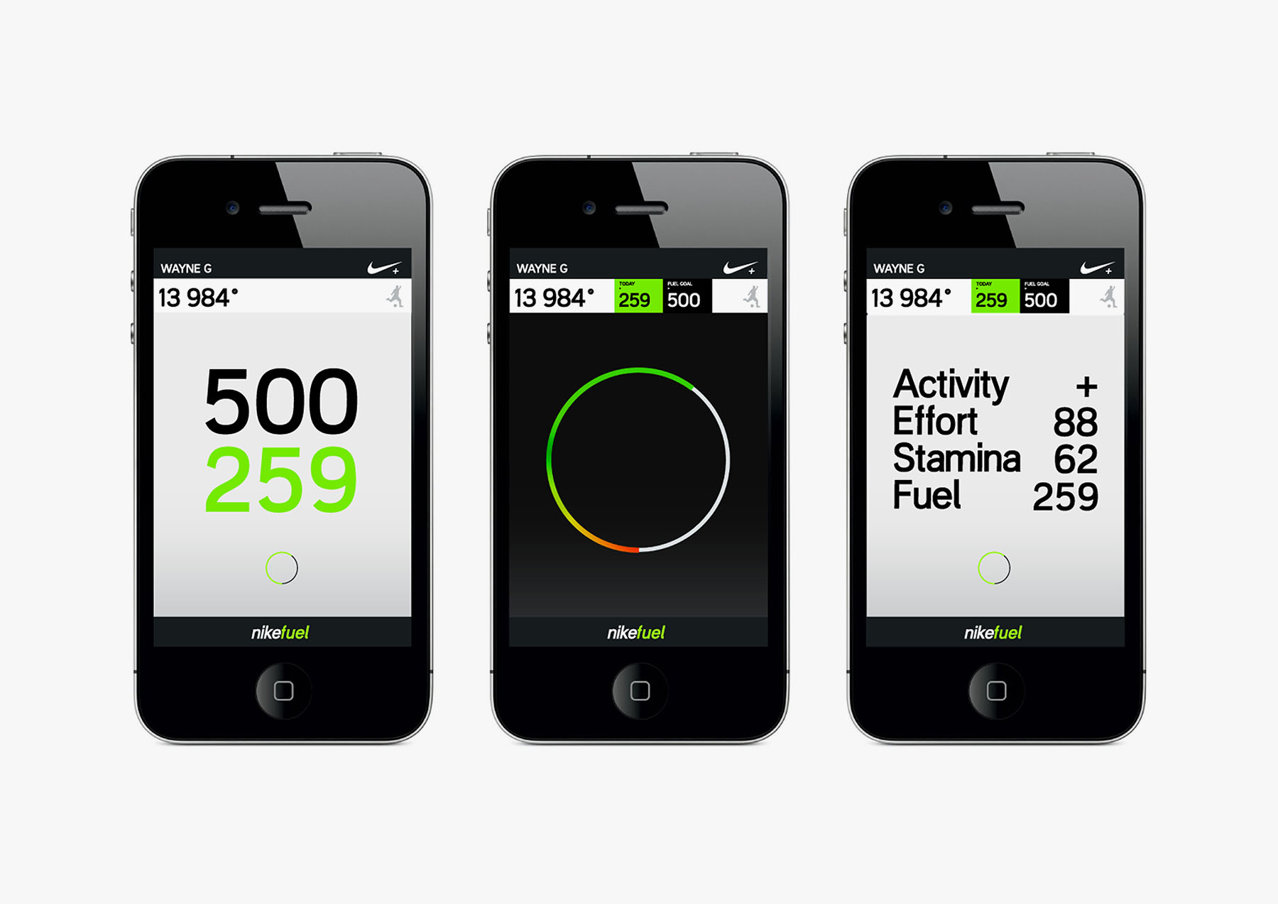
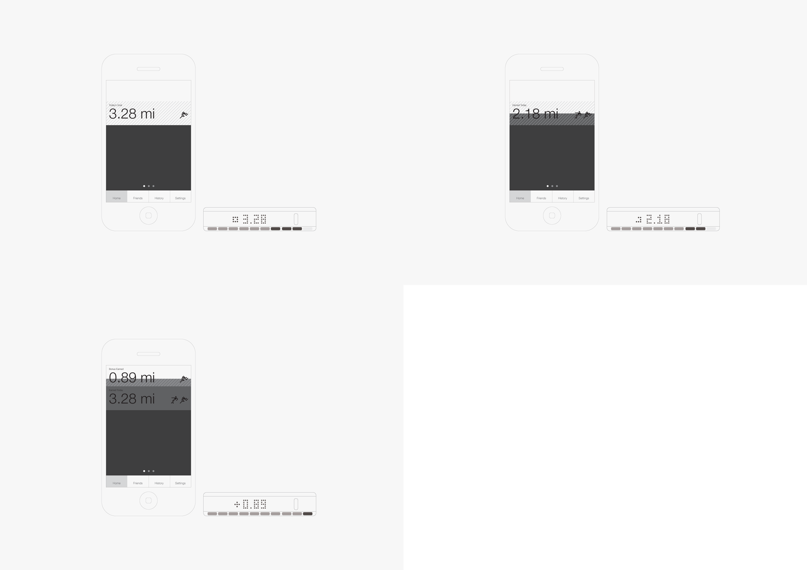
At this stage, the universal metric had been defined, and the user experience was coming together. What was left was to form tighter integration between the screens and the device while in the primary context —on the go, mobile.
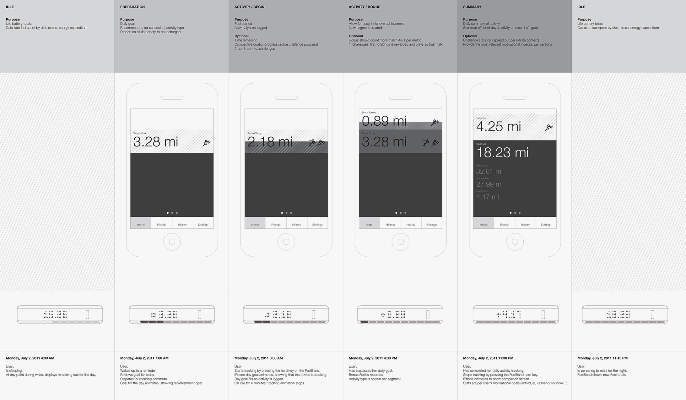
The following wireframes and simple animation illustrate the potential for real-time interaction/communication between the FuelBand and a mobile device —as companion devices / interfaces.
For this particular project, I found it most effective to illustrate both FuelBand and mobile device over the course of a day, states chunked by key points in the interaction:
- —Sleep
- —Goal presented
- —Activity / Fuel earned
- —Meeting / surpassing goal
- —Summary / totals / competitive
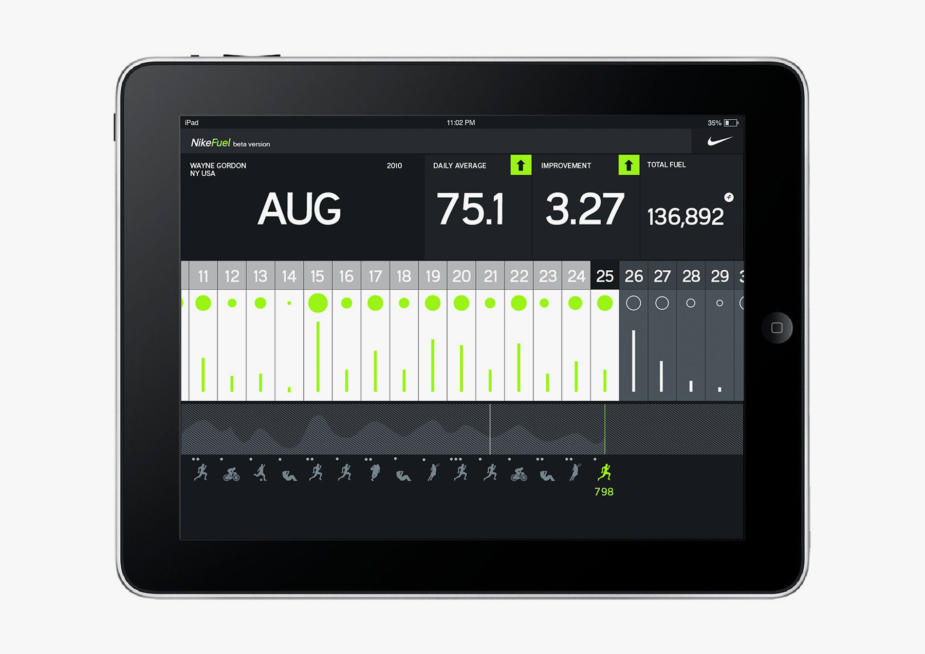
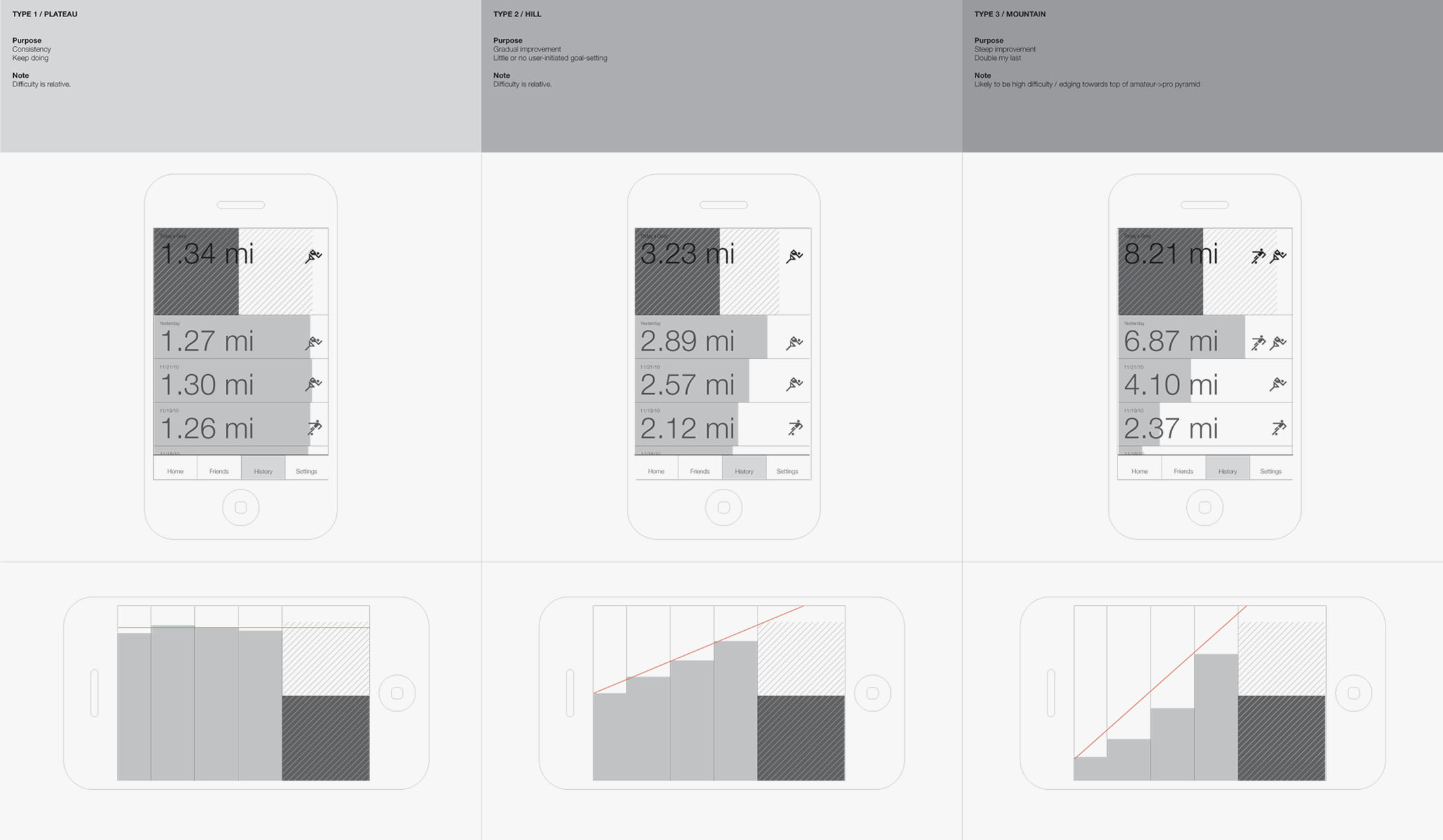
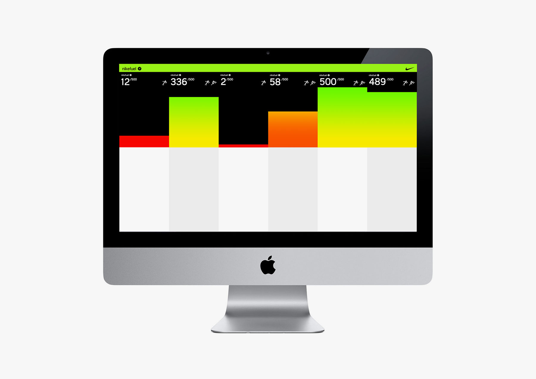
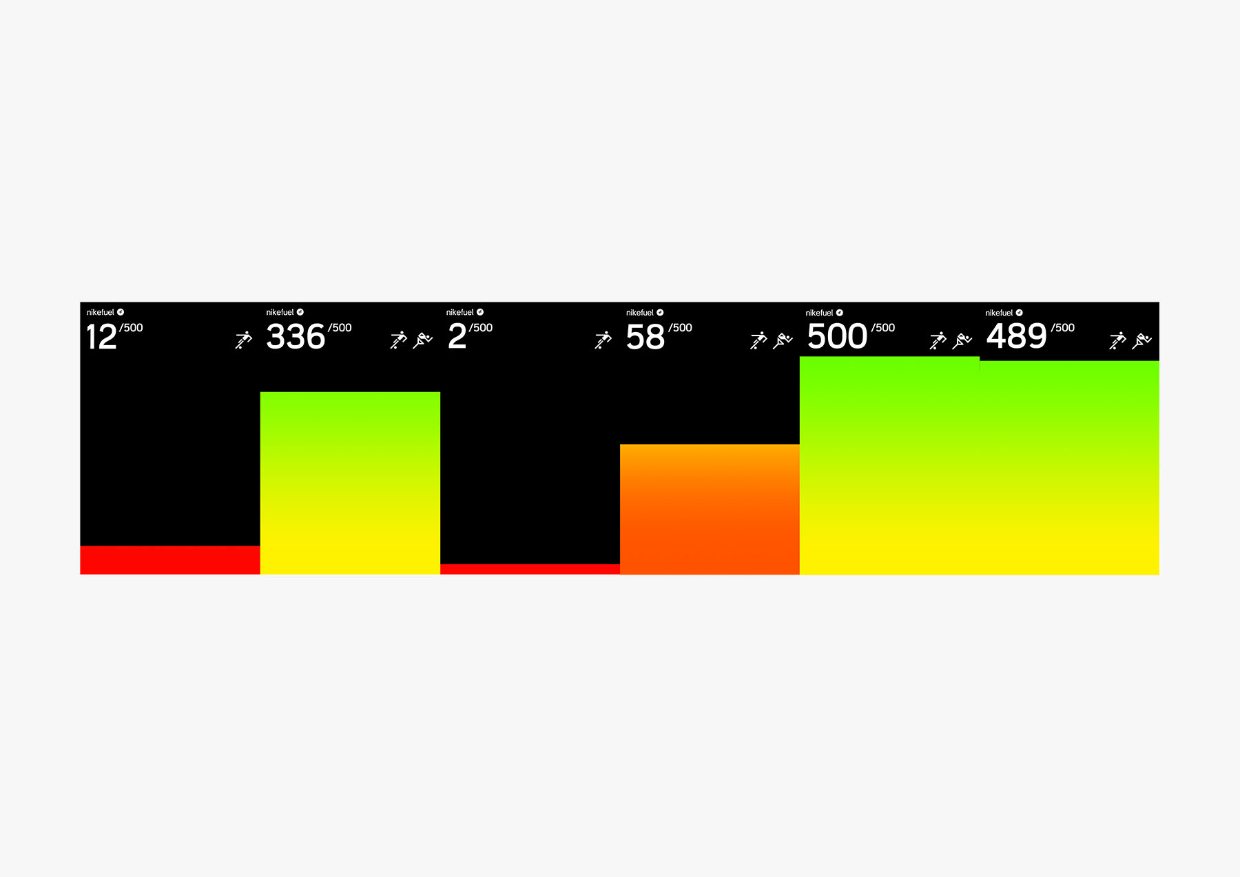
The language of Fuel earned over the course of a day extended graphically in the week view, which doubled as an indicator of rhythm per user type, of which a starting set of 3 were recommended (however an infinite number of patterns could be developed):
- —Consistency ("keep doing")
- —Gradual improvement (casual->intermediate training)
- —Steep improvement (intermediate->pro training)
08 / Extension
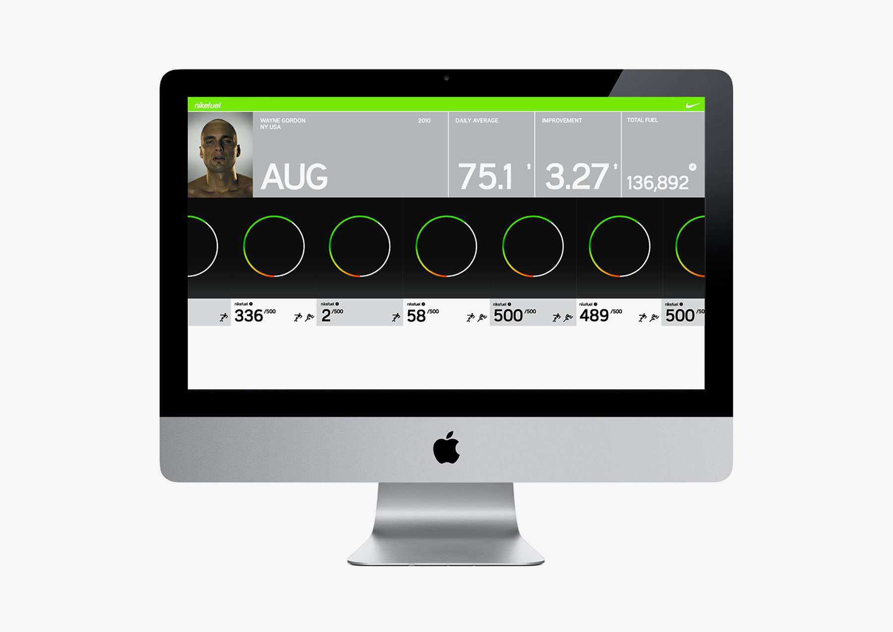
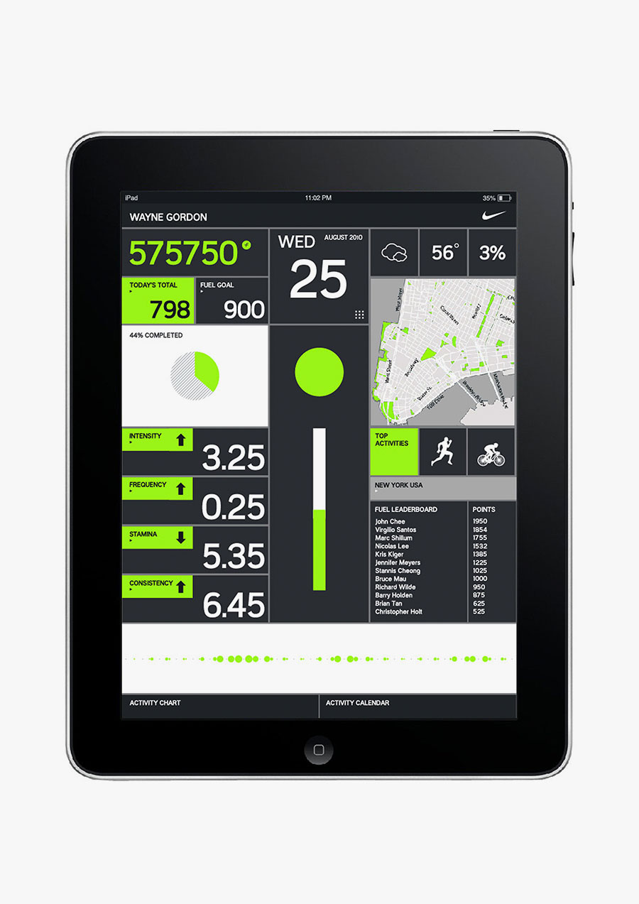
The results of integrated brand/visual/interaction languages culminated in the graphic simplicity of the following prototyped screens. The language was designed to fill virtually any resolution, were consistent with / extended the hardware design, and embodied the playful / motivational attributes of the brand. Elements of this version can be seen in use today with more experiential installations involving projection and related.
Contact ↴
@andrewchee
[email protected]
1 917 375 2524
All tags ↴
spaces
objects
interfaces
systems
actions
All projects ↴
155, 154, 153, 152, 151, 150, 149, 148, 147, 146, 145, 144, 143, 142, 141, 140, 139, 138, 137, 136, 135, 134, 133, 132, 131, 130, 129, 128, 127, 126, 125, 124, 123, 122, 121, 120, 119, 118, 117, 116, 115, 114, 113, 112, 111, 110, 109, 108, 107, 106, 105, 104, 103, 102, 101, 100, 099, 098, 097, 096, 095, 094, 093, 092, 091, 090, 089, 088, 087, 086, 085, 084, 083, 082, 081, 080, 079, 078, 077, 076, 075, 074, 073, 072, 071, 070, 069, 068, 067, 066, 065, 064, 063, 062, 061, 060, 059, 058, 057, 056, 055, 054, 053, 052, 051, 050, 049, 048, 047, 046, 045, 044, 043, 042, 041, 040, 039, 038, 037, 036, 035, 034, 033, 032, 031, 030, 029, 028, 027, 026, 025, 024, 023, 022, 021, 020, 019, 018, 017, 016, 015, 014, 013, 012, 011, 010, 009, 008, 007, 006, 005, 004, 003, 002, 001, 000.
Updated ↴
2024 Apr 28 12:09:01 UTC, CC BY-SA International, Andrew Chee.
