| 030 | CHANEL Brand Interface / Reflection Interactive system for all touch points; concept and interaction design, as R/GA |
23 | 2010 11 |
Interactive system for all touch points; concept and interaction design, as R/GA.
Role:
Interaction Design Director, Brand Development
Agency:
R/GA New York
01 / Concept
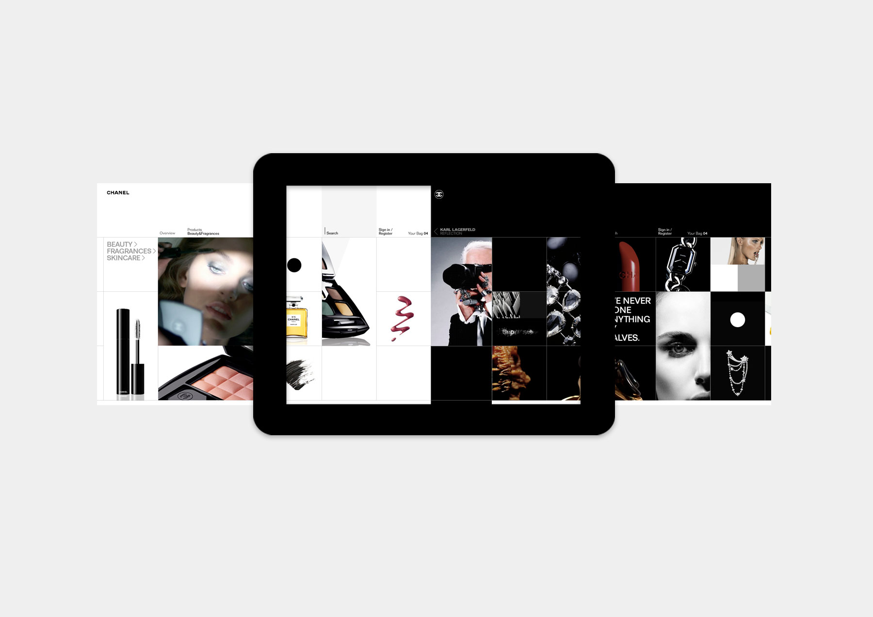
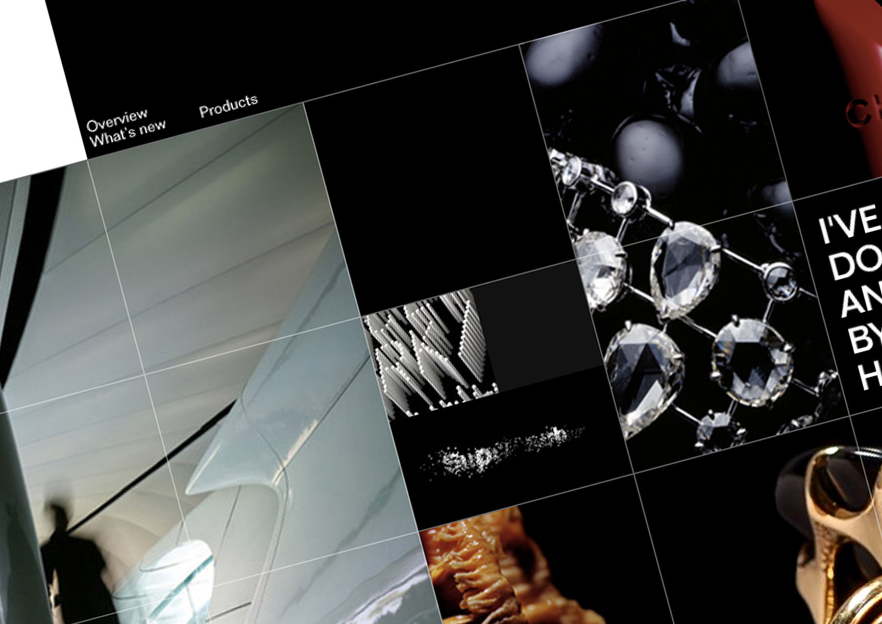
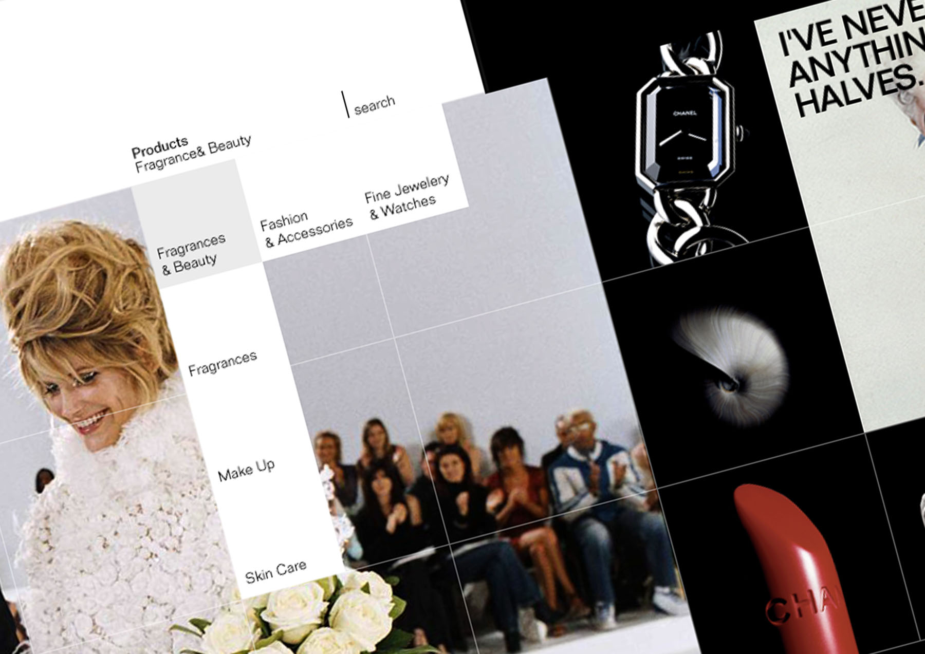
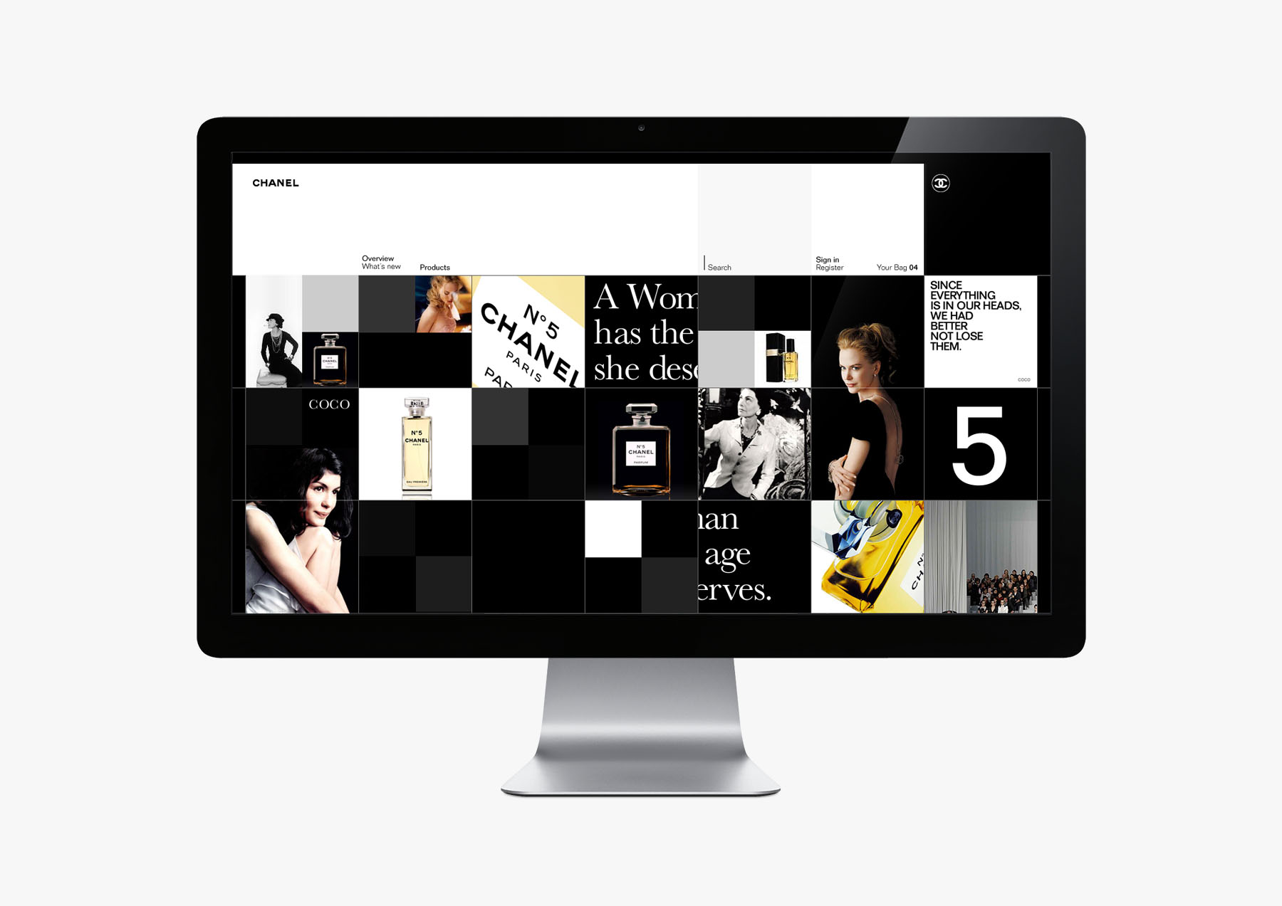
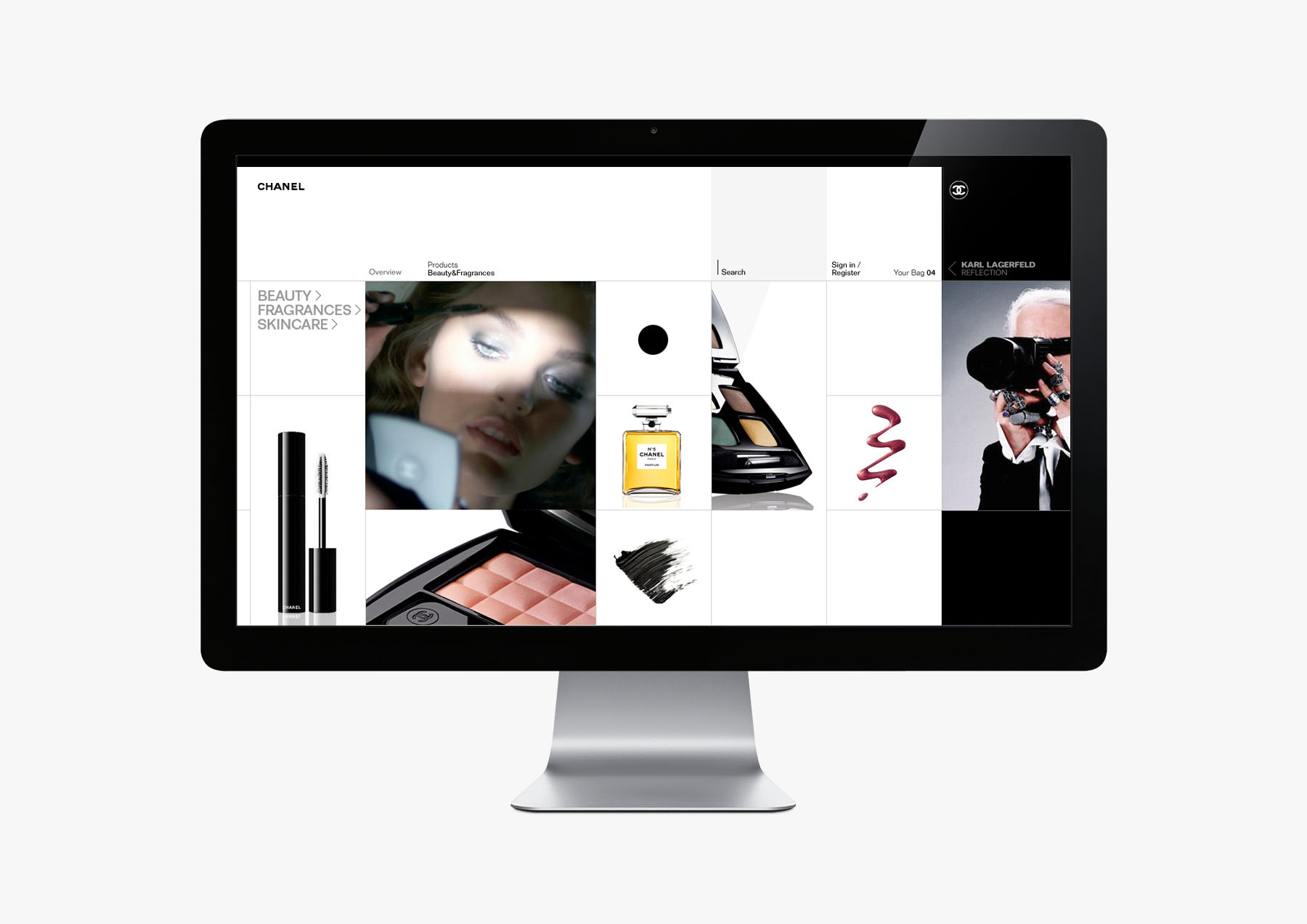
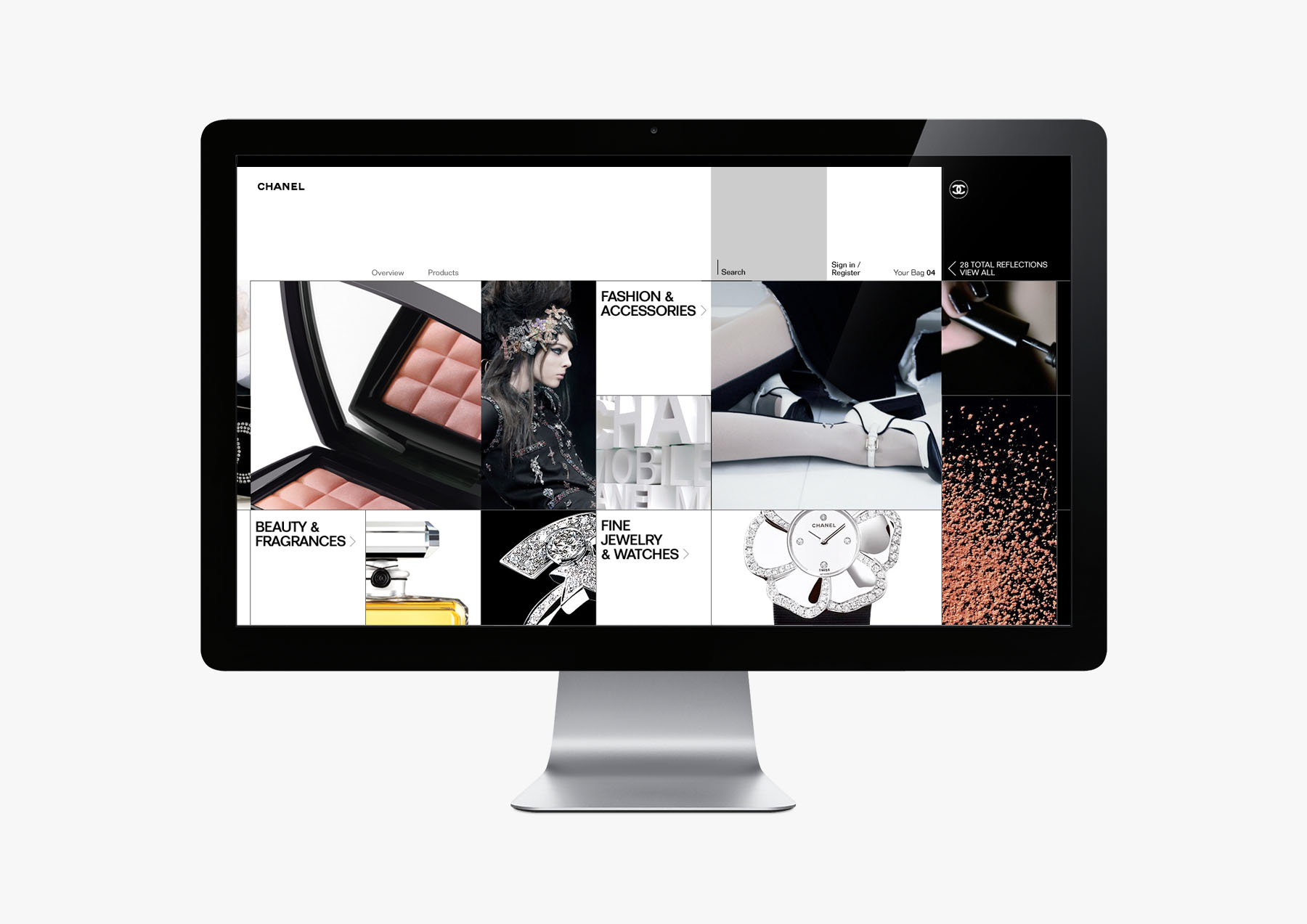
In late 2008, I led the complete digital redesign of CHANEL from strategy, interaction, experiential, and ecommerce, as a key project for the Brand Development group. The challenge was to tie together disparate entities across both USA and France content, for both product and brand expression. The current digital platform did not do justice to the timelessness of the brand. A reexamination of the brand essence yielded a simple brand behavior unique to CHANEL, the Reflection. Inspired by the business savvy (product/commerce) and depth of character (brand expression) of both Coco Chanel and Karl Lagerfeld, every interaction in the new platform would interlink via two sides of the same coin, the fusion of objects to meaning, from product to inspiration and back.
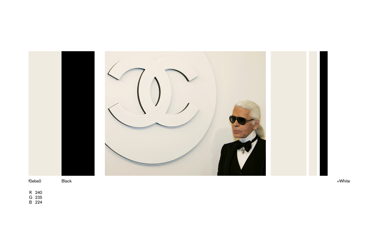
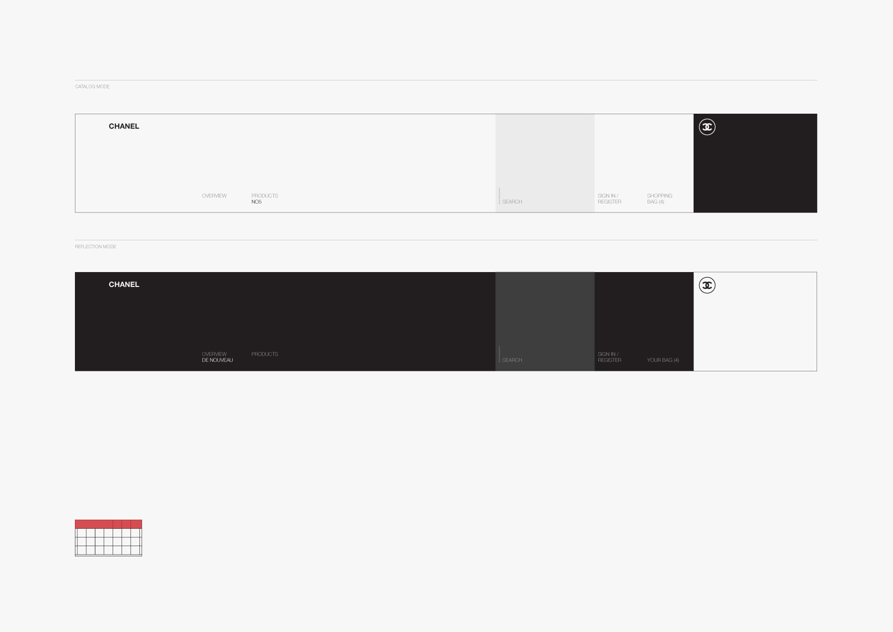
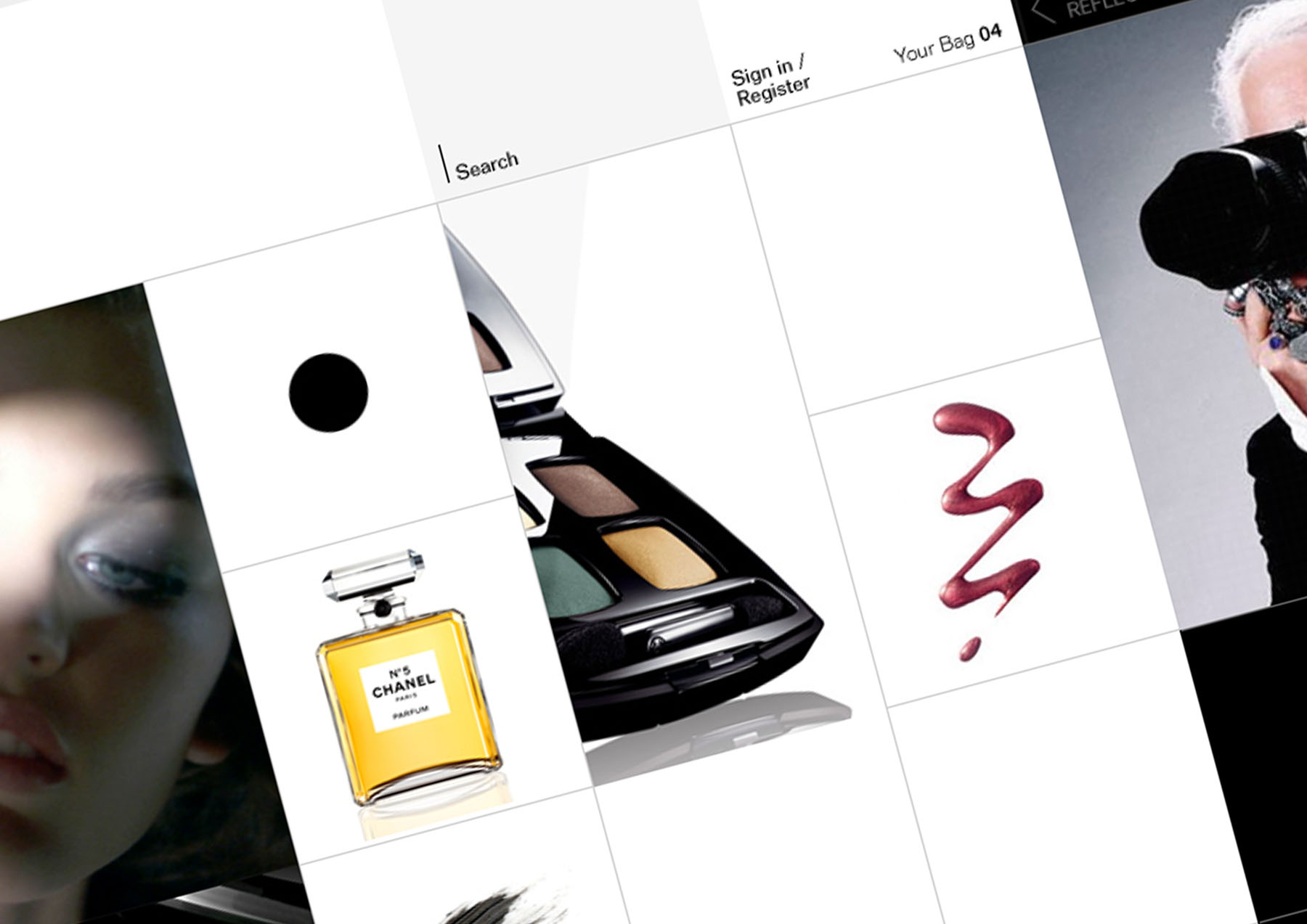
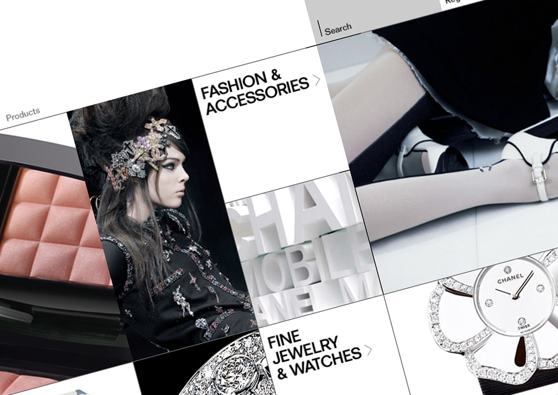
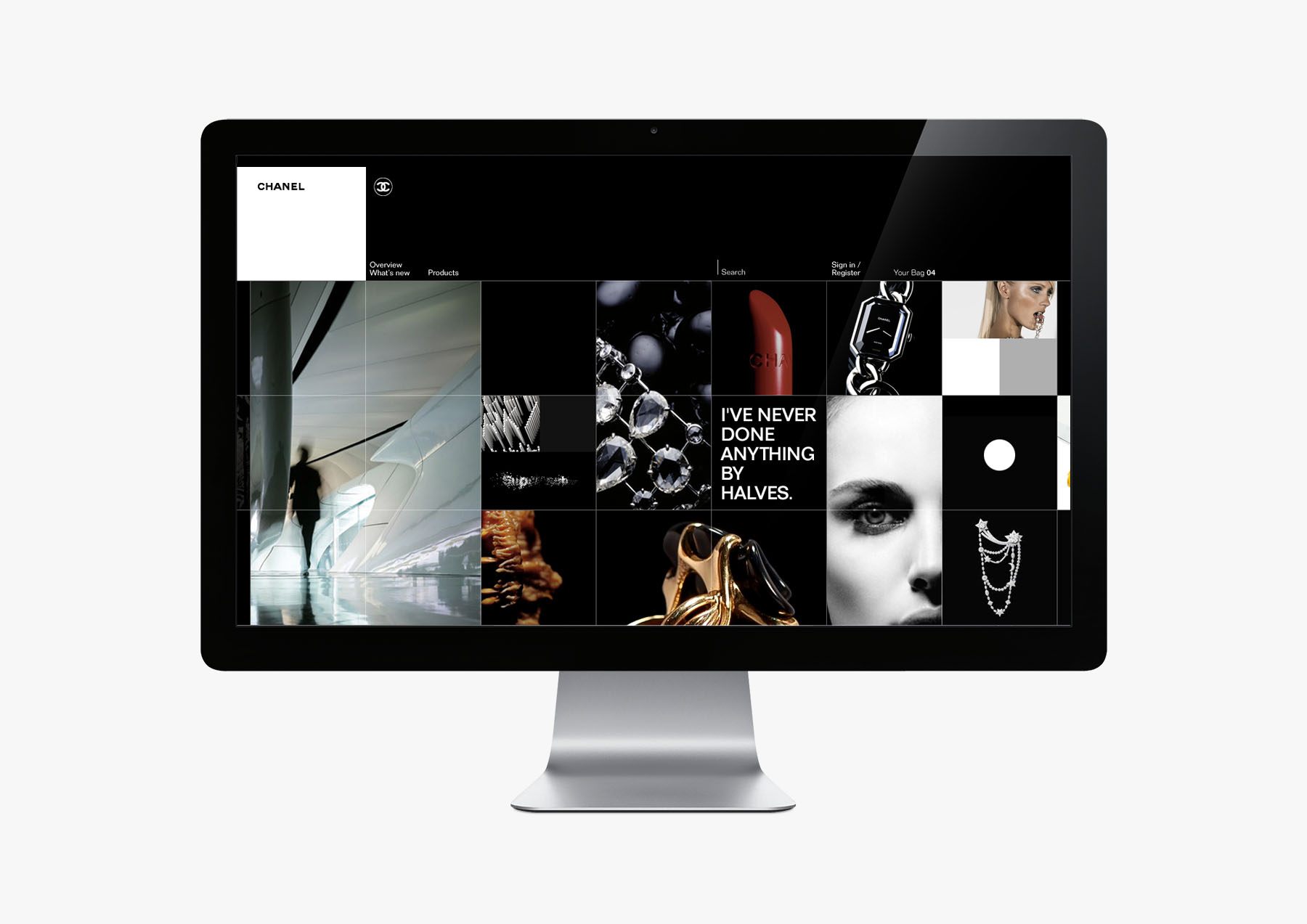
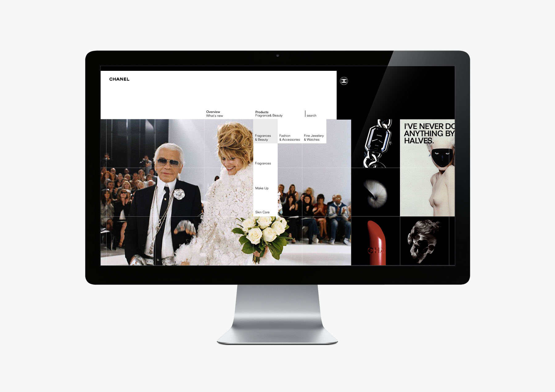
Both interaction and visual language were inspired deeply by the stark and confident CHANEL palette of black and white, as well as the presence of the square and modularity as the form most employed in CHANEL properties from art to retail to product. What resulted was a dramatic expression of the brand that we felt was uniquely CHANEL. It won the business for the agency.
Phases:
—Brand Research
—User Research
—Concept Development
02 / Structure
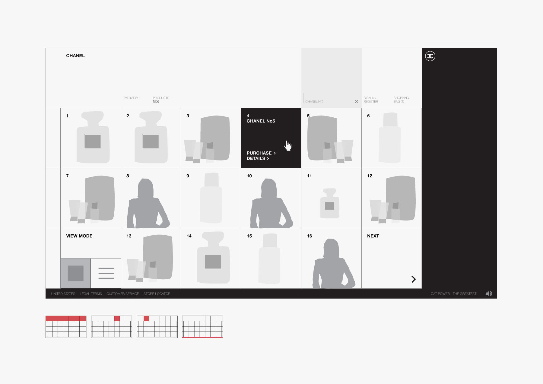
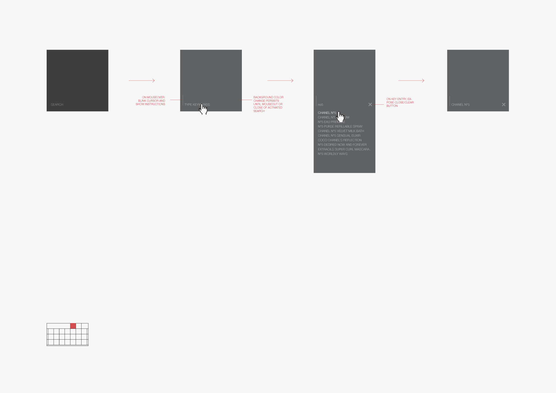
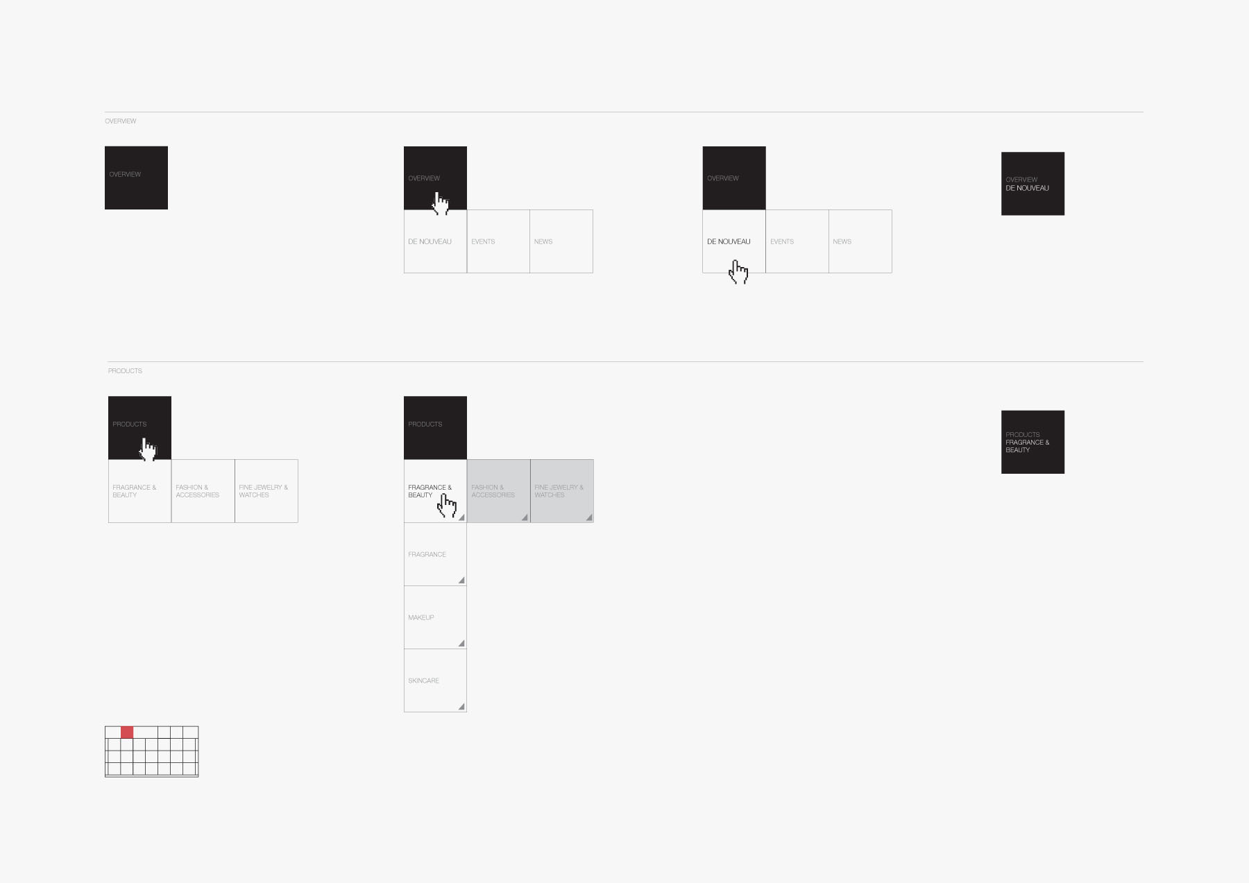
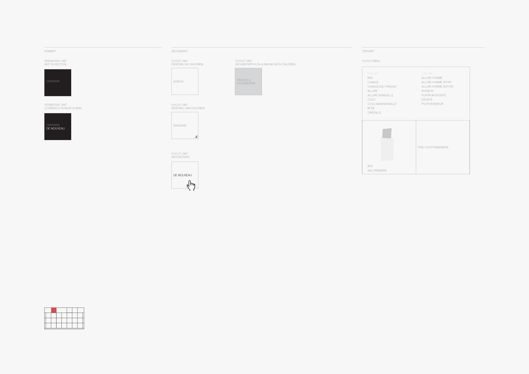
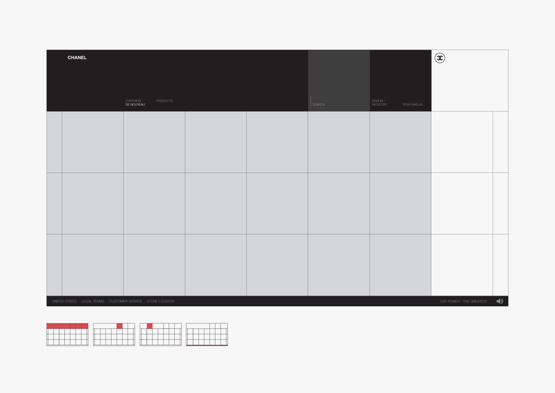
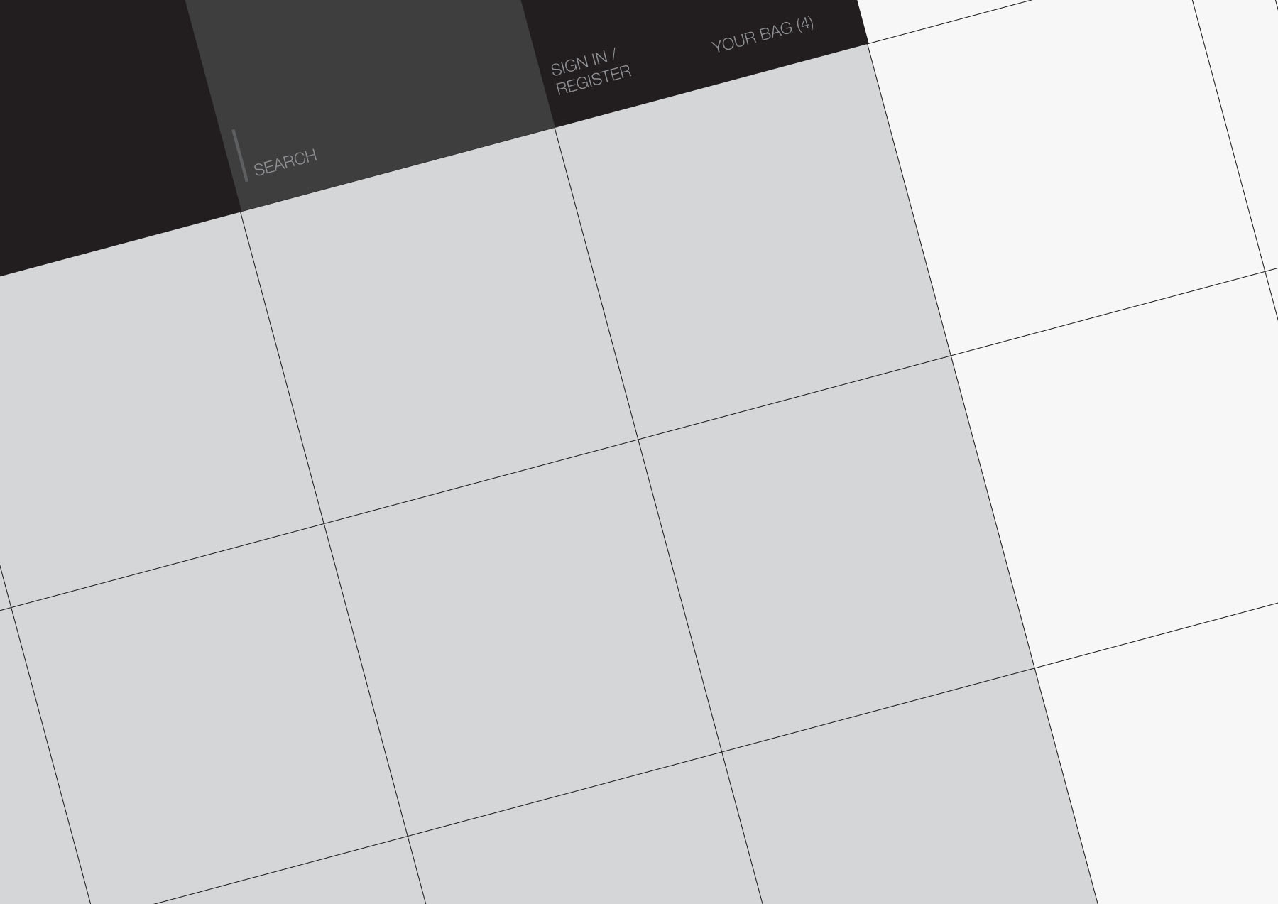
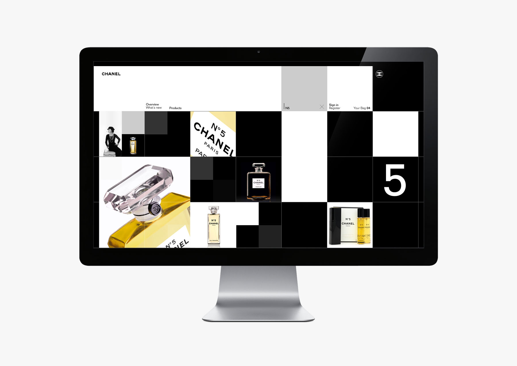
For such a strong brand, with such a uniquely simple and consistent brand language, even the process for interaction design was to fit. Stripping out all extraneous detail was the result of countless iterations, resulting in an interaction system that was modular and allowed for the linkage from Product to Experience from virtually any piece of content —the Reflection. The square, manifested itself at 3 points of scale throughout the user interface, from navigation to content. This discipline ensured large square hit areas for that would also allow for rich visual expression.
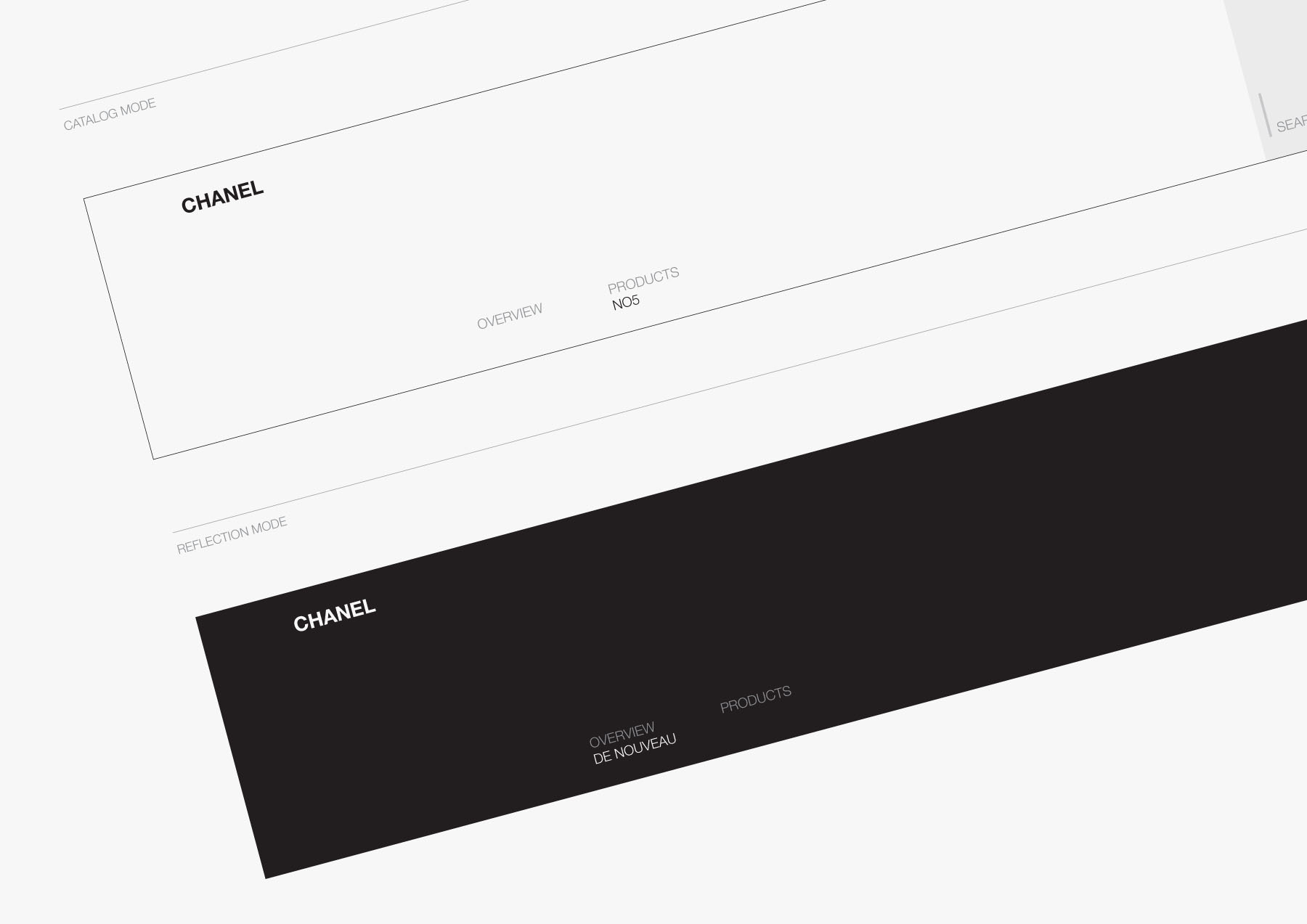
The following are key points in the wireframing and paper prototyping process, an excerpt of the final deliverable.
Phases:
—Concept Development
—Design Iterations
—Prototyping
03 / Expression
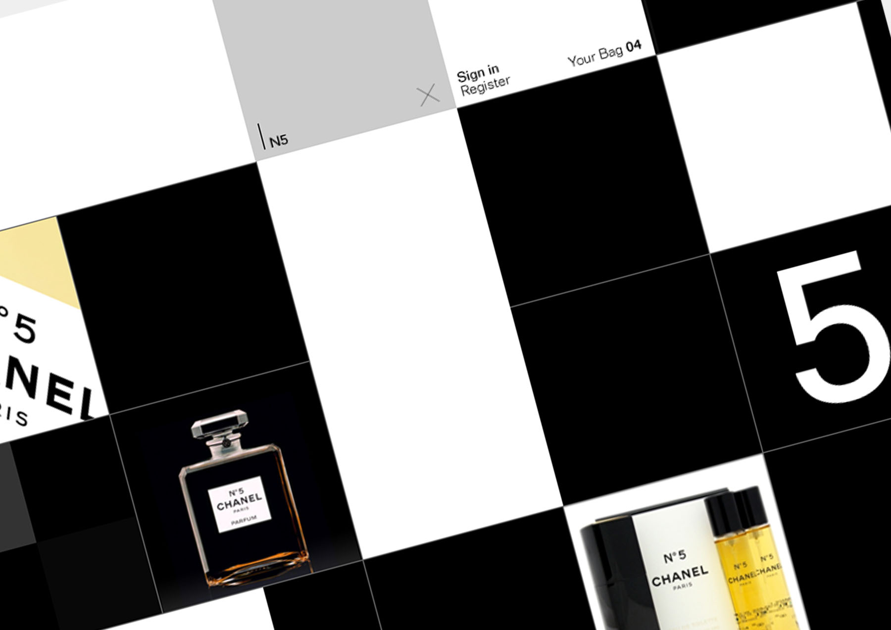
The generous grid was pushed to its full potential in both Catalog and Experience modes. What resulted from these iterations was the interplay between black and white units, thus allowing for hybrid states where both Catalog and Experience would intermingle (ideal for special events, retail features, and what otherwise would be too experimental for the straight Catalog).
In further iterations, the grid size would be tightened further, and the navigation system prototyped in motion. With today's technology, a responsive sizing for the units and typography would allow better performance in the auto-scaling of the units.
This project was the result of tight and iterative collaboration with the Design Director, Virgilio Santos.
Phases:
—Concept Development
—Design Iterations
—Prototyping
Contact ↴
@andrewchee
[email protected]
1 917 375 2524
All tags ↴
spaces
objects
interfaces
systems
actions
All projects ↴
155, 154, 153, 152, 151, 150, 149, 148, 147, 146, 145, 144, 143, 142, 141, 140, 139, 138, 137, 136, 135, 134, 133, 132, 131, 130, 129, 128, 127, 126, 125, 124, 123, 122, 121, 120, 119, 118, 117, 116, 115, 114, 113, 112, 111, 110, 109, 108, 107, 106, 105, 104, 103, 102, 101, 100, 099, 098, 097, 096, 095, 094, 093, 092, 091, 090, 089, 088, 087, 086, 085, 084, 083, 082, 081, 080, 079, 078, 077, 076, 075, 074, 073, 072, 071, 070, 069, 068, 067, 066, 065, 064, 063, 062, 061, 060, 059, 058, 057, 056, 055, 054, 053, 052, 051, 050, 049, 048, 047, 046, 045, 044, 043, 042, 041, 040, 039, 038, 037, 036, 035, 034, 033, 032, 031, 030, 029, 028, 027, 026, 025, 024, 023, 022, 021, 020, 019, 018, 017, 016, 015, 014, 013, 012, 011, 010, 009, 008, 007, 006, 005, 004, 003, 002, 001, 000.
Updated ↴
2024 Apr 28 12:08:41 UTC, CC BY-SA International, Andrew Chee.
